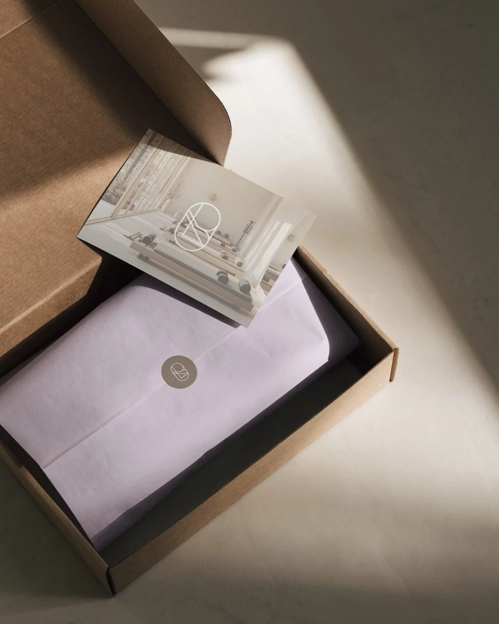
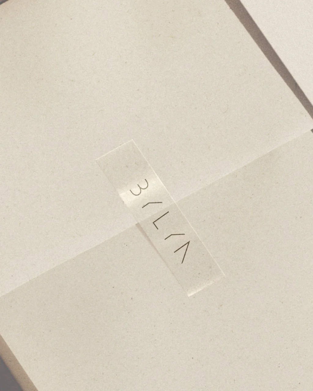
BYLYN
Branding/Packaging/Social Media
For this private Pilates studio in Belgium, located in a beautiful setting surrounded by nature, we crafted the brand storytelling, the strategic foundation of the brand, the visual identity, and the social presence.
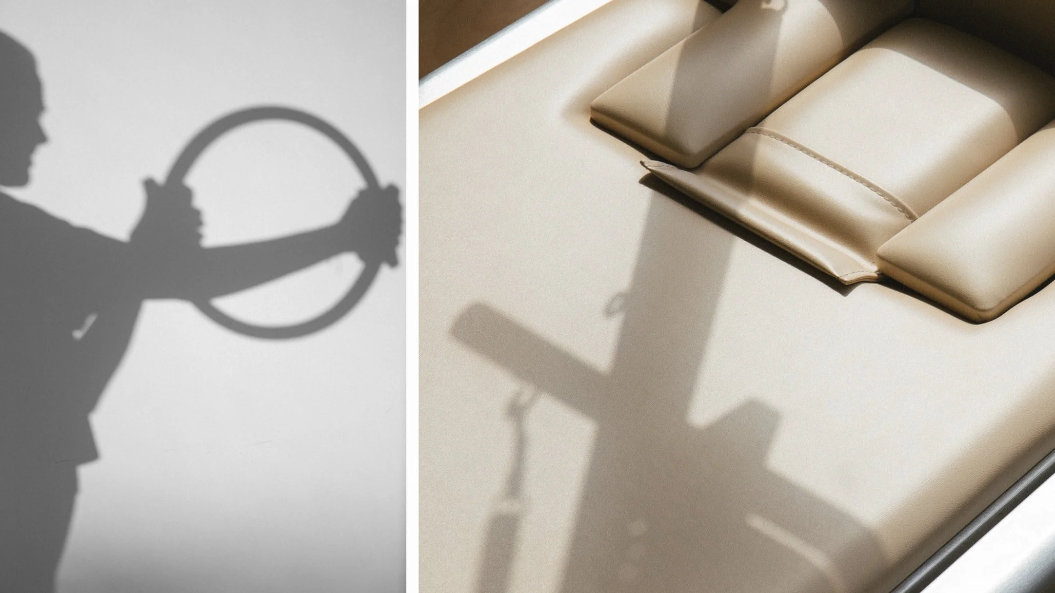
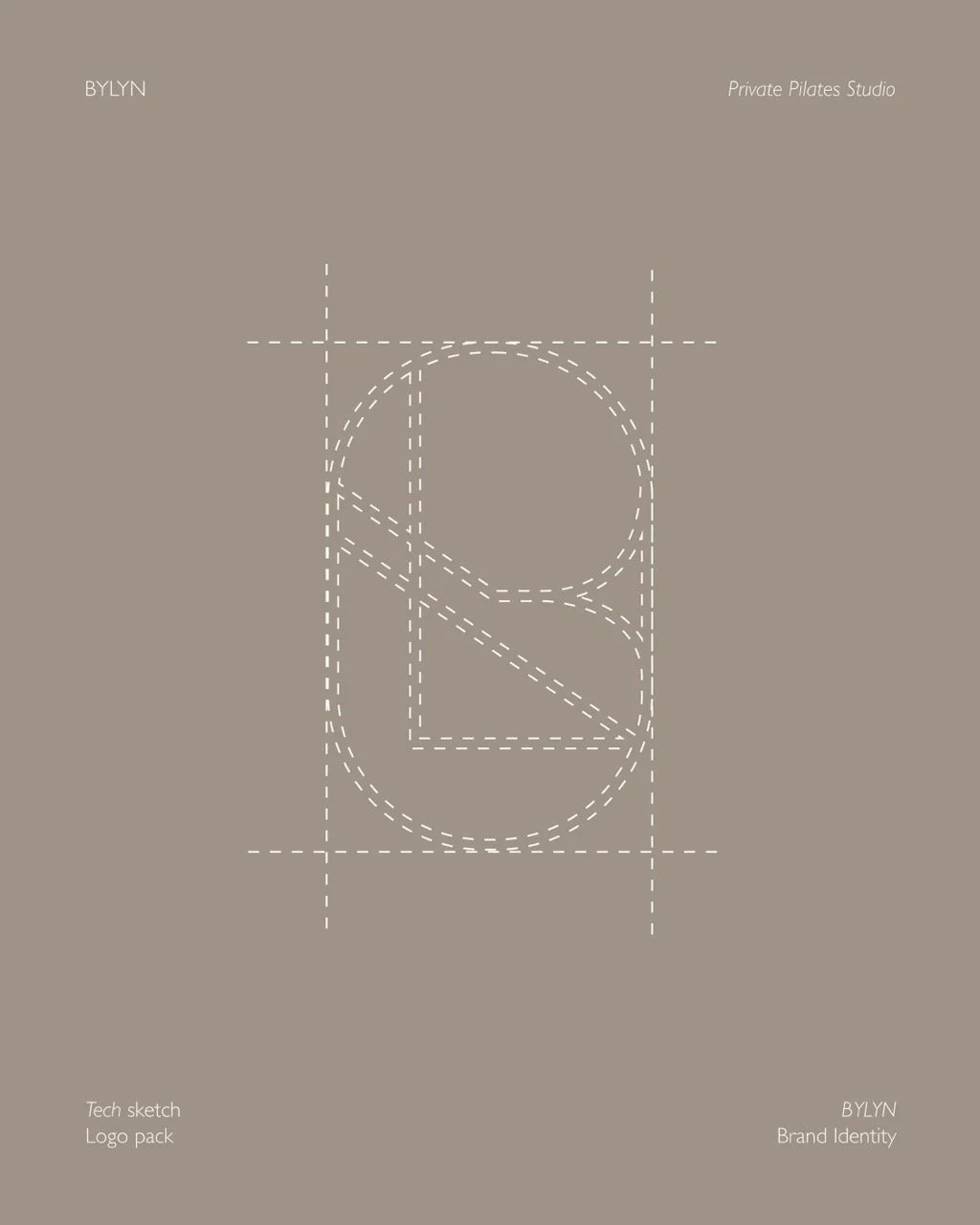
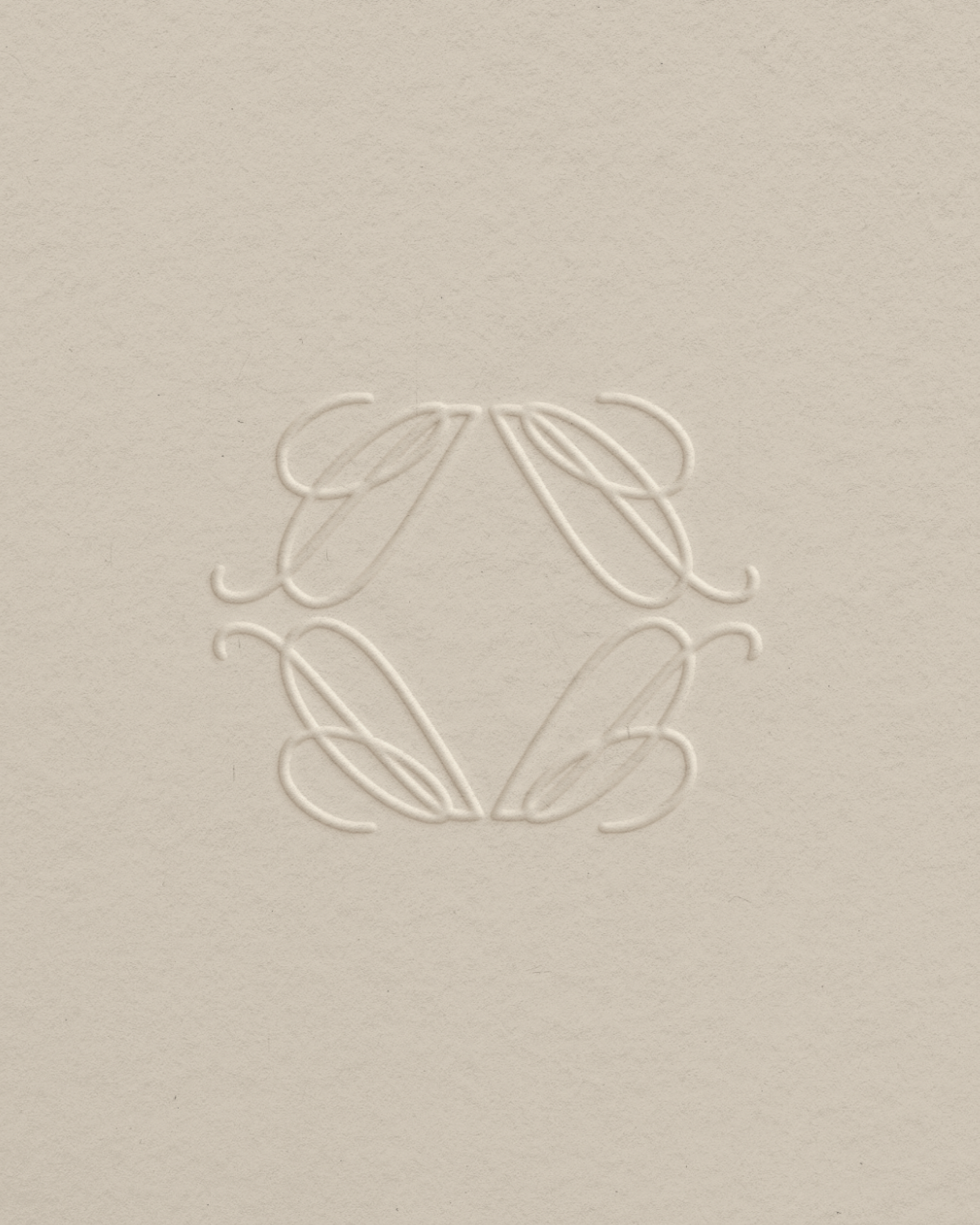
During the initial brand exploration, we discovered that the use of lines, echoing the movement patterns of Pilates, would become a defining element in the design language. We also aimed to convey a sense of trust and the power of simplicity.
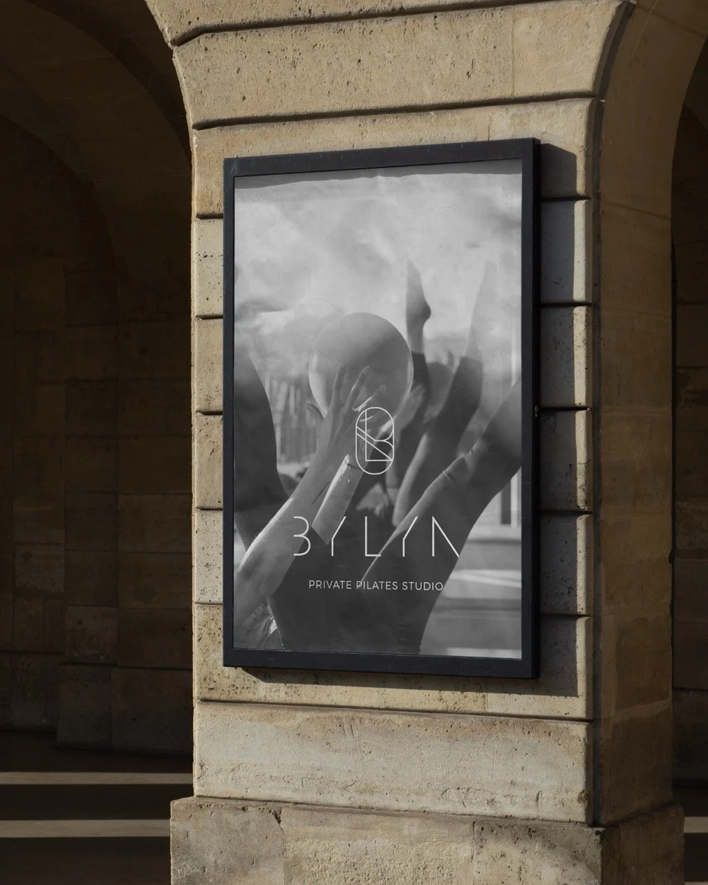
This is reflected clearly in the primary logo: the letters and lines speak for themselves, subtly forming the name BYLYN without over-explaining. The letterforms also return in the monogram, offering a graphic, modern aesthetic that subtly nods to the linear motion of Pilates.


How we transformed BYLYN
We translated the serene atmosphere of this Belgian private studio into a calm, strategic brand identity grounded in the essence of movement. Inspired by the linear patterns of Pilates, we built a visual language centered on simplicity, trust, and fluid lines. This approach comes to life in the primary logo and modern monogram, where the letterforms effortlessly form the name BYLYN without over-explaining. By carrying this clean aesthetic through to their social media presence, the final result is a minimalist and cohesive brand world that mirrors the studio's natural surroundings and honors the precise motion of the practice.
-
Cafe Auguste
August, 2025
-
Ligne
March, 2025
-
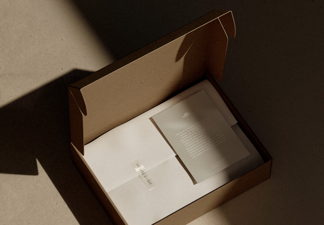
House of I Am
March, 2024