Trouve
Branding/Packaging
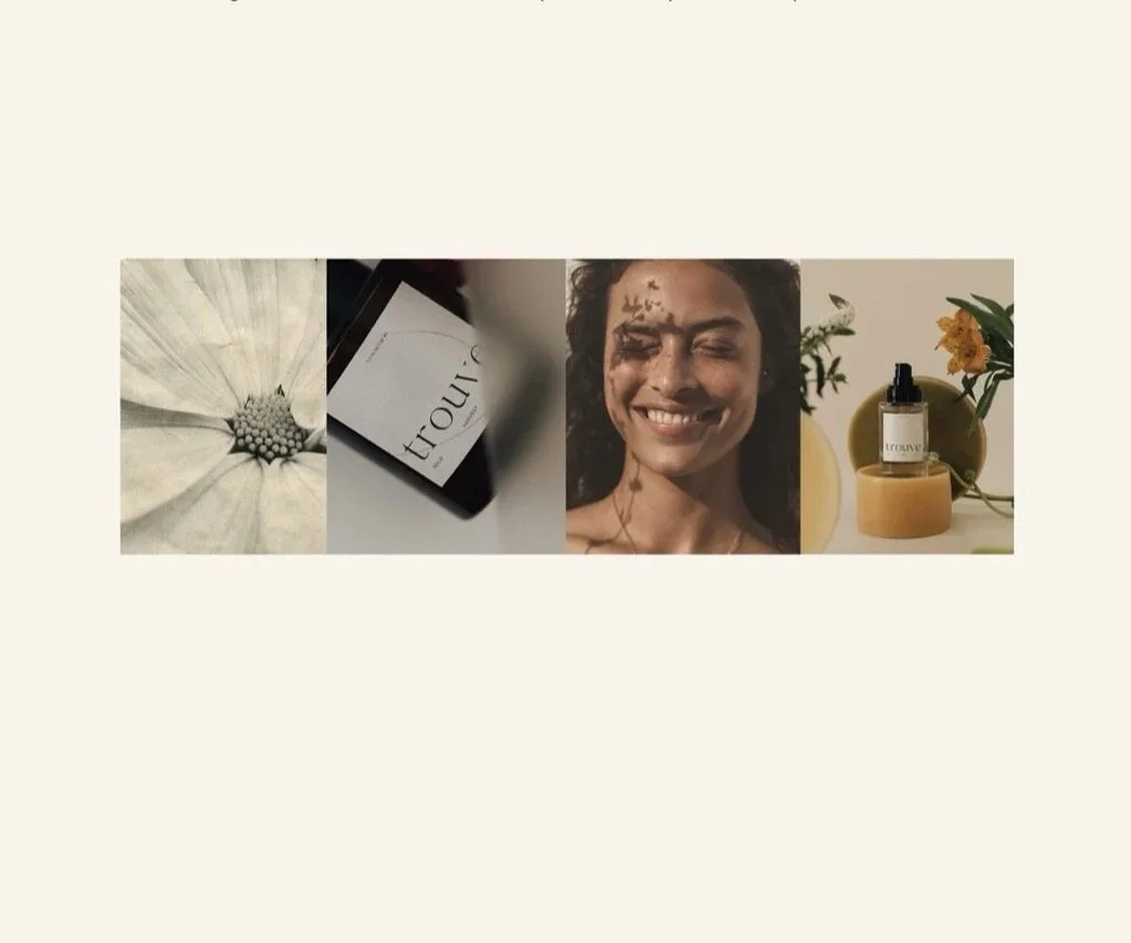
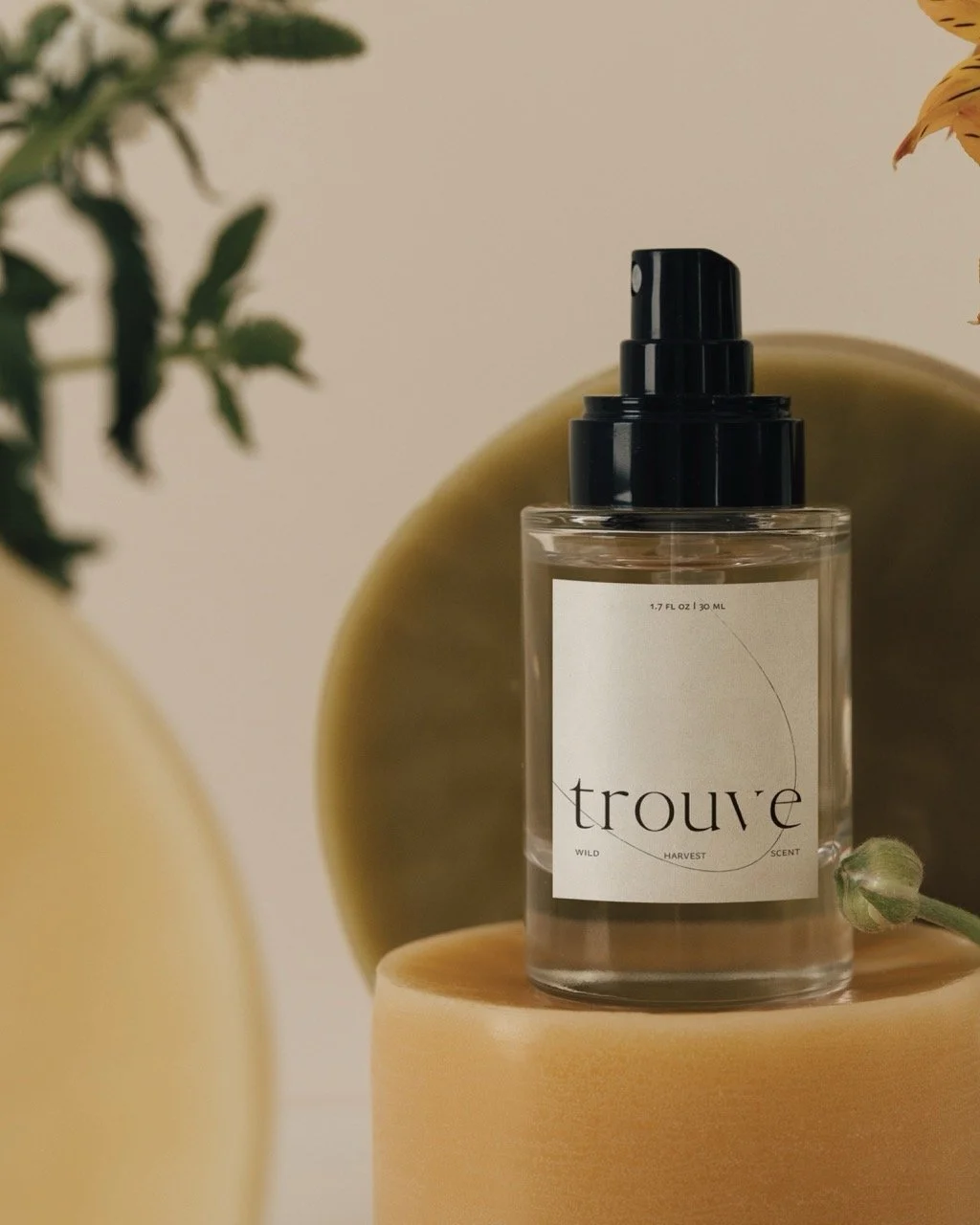
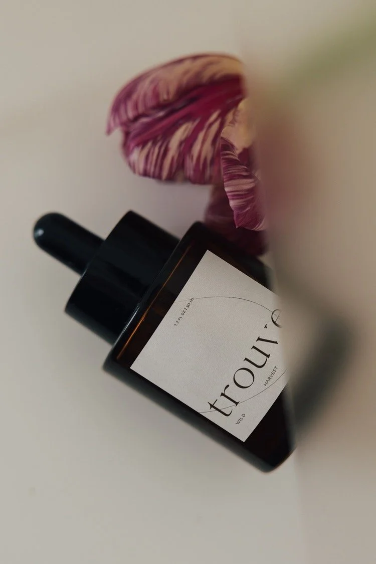
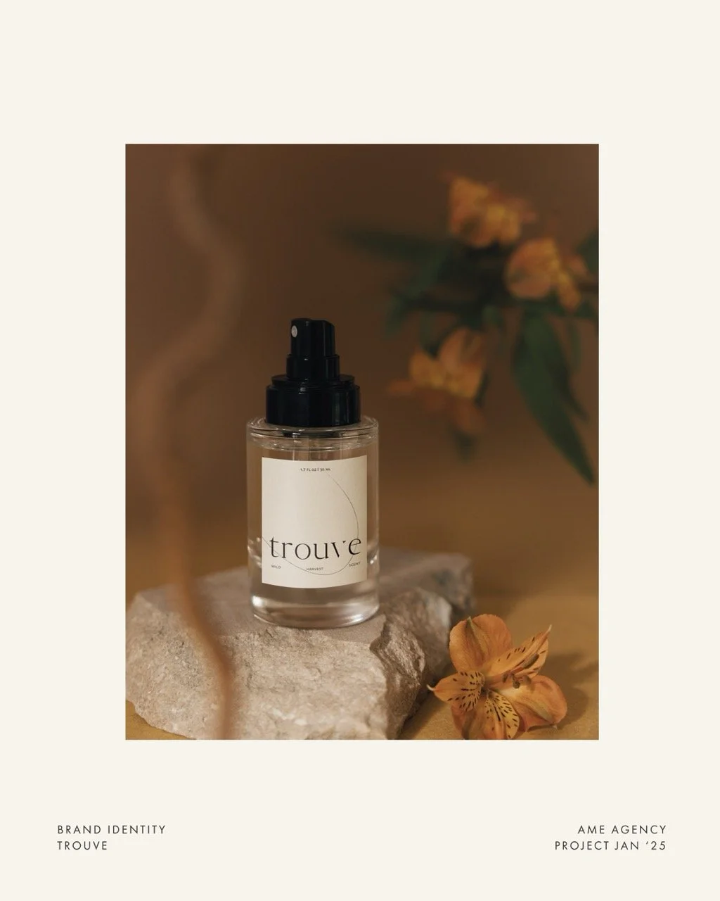
Brand Identity and Packaging design for Trouve. At the core of Trouve’s packaging design is a fine hand-drawn line, reflecting the meticulous craftsmanship that goes into every bottle. This aesthetic pays homage to Scandinavian design principles that prioritize simplicity and functionality, while also embracing Mediterranean influences that evoke a sense of warmth and connection to nature. The result is a packaging concept that is both striking and harmonious, inviting consumers to engage with the product on a deeper level.
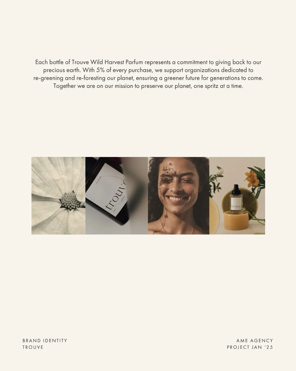
Each bottle of Trouve Wild Harvest Scent represents a commitment to giving back to our precious earth. With 5% of every purchase, Trouve supports organizations dedicated to re-greening and re-foresting our planet, ensuring a greener future for generations to come. Together we are on our mission to preserve our planet, one spritz at a time.
How we transformed Trouve
We brought the spirit of Trouve to life by creating a striking brand identity and packaging system that balances two distinct worlds. By combining clean Scandinavian simplicity with warm, nature-inspired Mediterranean influences, we gave the brand a harmonious yet prominent shelf presence. The delicate, hand-drawn line art emphasizes the meticulous craftsmanship behind every bottle, making the packaging feel premium and tactile. The final result is a cohesive visual experience that elevates the product, inviting consumers to connect deeply with the care and artistry behind the brand.
-
Cafe Auguste
August, 2025
-
Ligne
March, 2025
-
House of I Am
March, 2024