Cafe Auguste
Branding/Packaging/Social Media
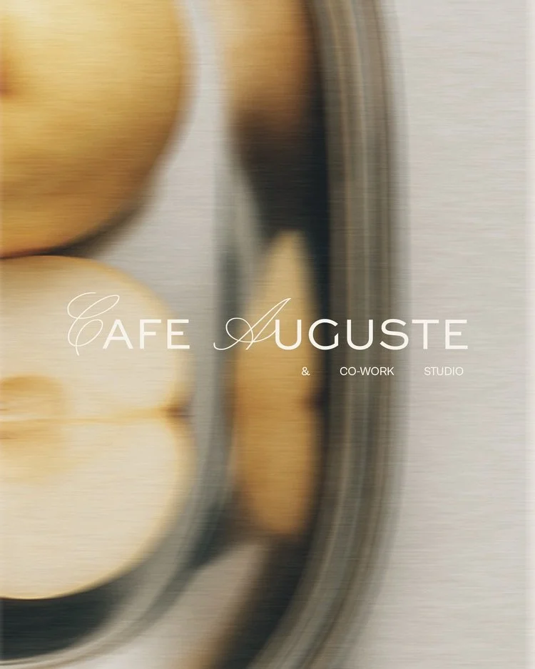
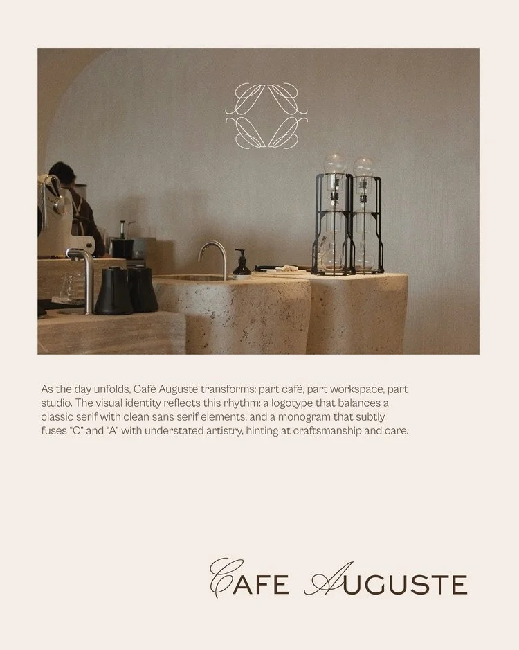
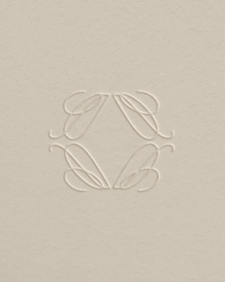
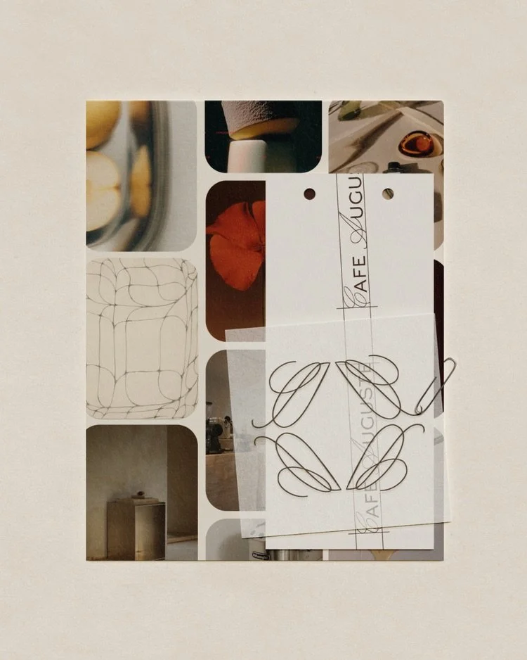
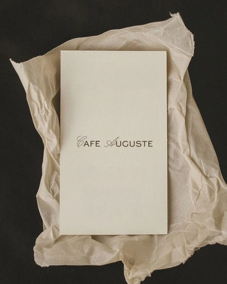
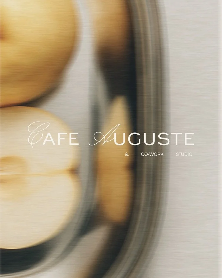
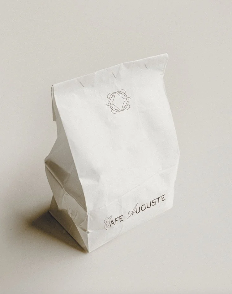
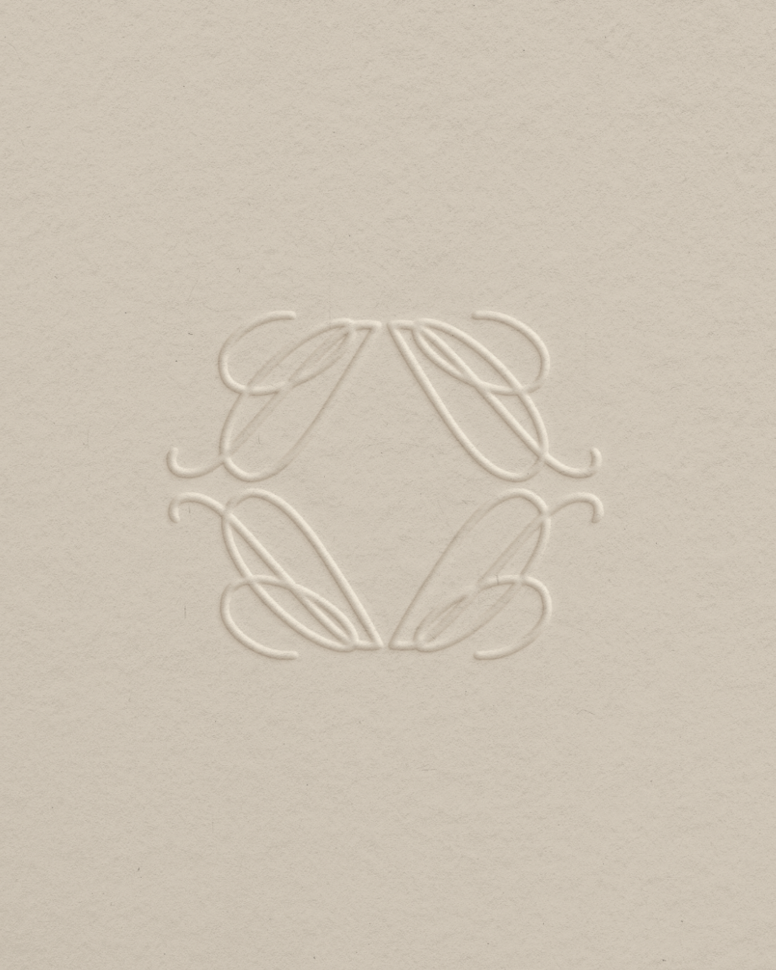
As the day unfolds, Café Auguste transforms: part café, part workspace, part studio. The visual identity reflects this rhythm: a logotype that balances a classic serif with clean sans serif elements, and a monogram that subtly merges the C and A with understated artistry.
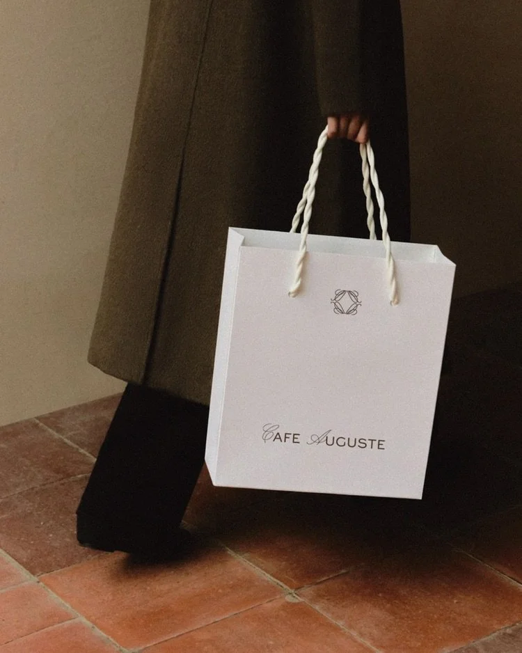
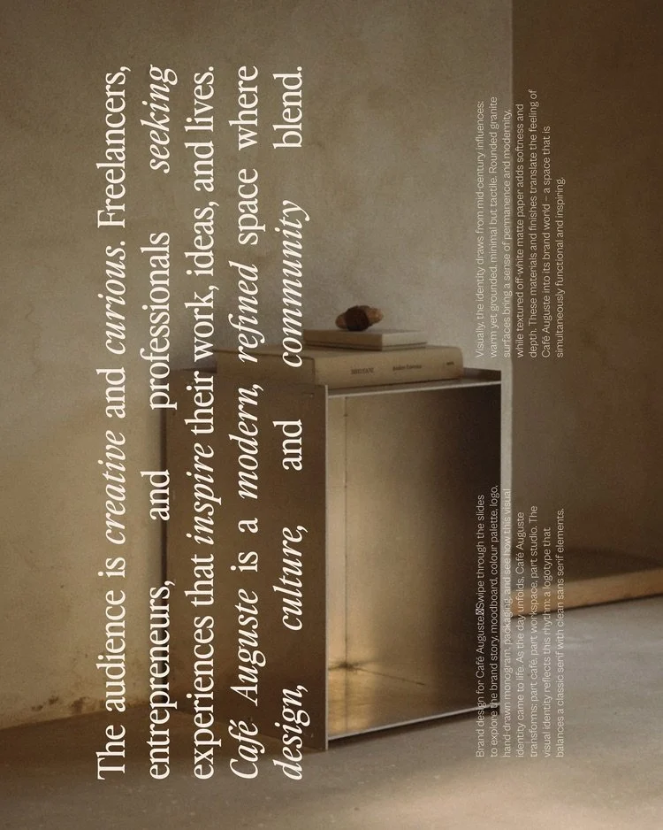
Visually, the identity draws from mid-century influences: warm yet grounded, minimal but tactile. Rounded granite surfaces bring a sense of modernity, while textured off-white matte paper adds depth. These materials and finishes translate the feeling of Café Auguste into its brand world, a space that is functional and inspiring.
The audience is creative and curious. Freelancers, entrepreneurs, and professionals seeking experiences that inspire their work, ideas, and lives. Café Auguste is a modern, refined space where design, culture, and community blend.
How we transformed Cafe Auguste
We brought Café Auguste’s multi-layered concept into a single, cohesive brand world. By balancing mid-century warmth with clean, modern typography, we gave the space a distinct identity that feels both functional for morning workspaces and inspiring for evening studios. Every material choice, from the tactile matte paper to the custom monogram, was designed to elevate the physical experience. The result is a refined, welcoming destination that naturally brings together a community of creative freelancers and entrepreneurs.
-
Cafe Auguste
August, 2025
-
Ligne
March, 2025
-
House of I Am
March, 2024