House of I Am
Branding/Packaging/Social Media
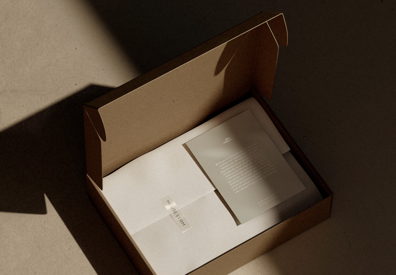
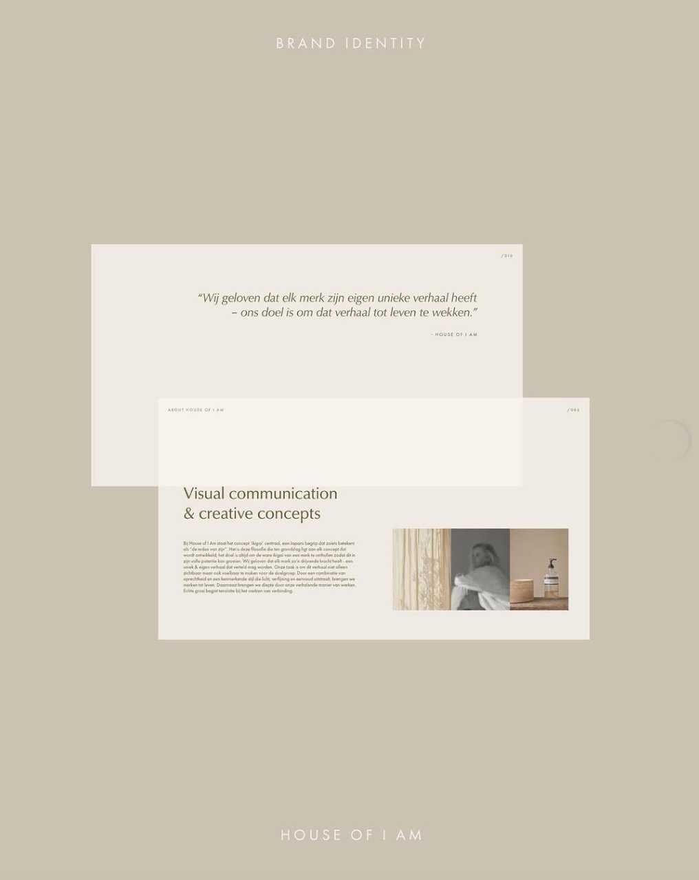
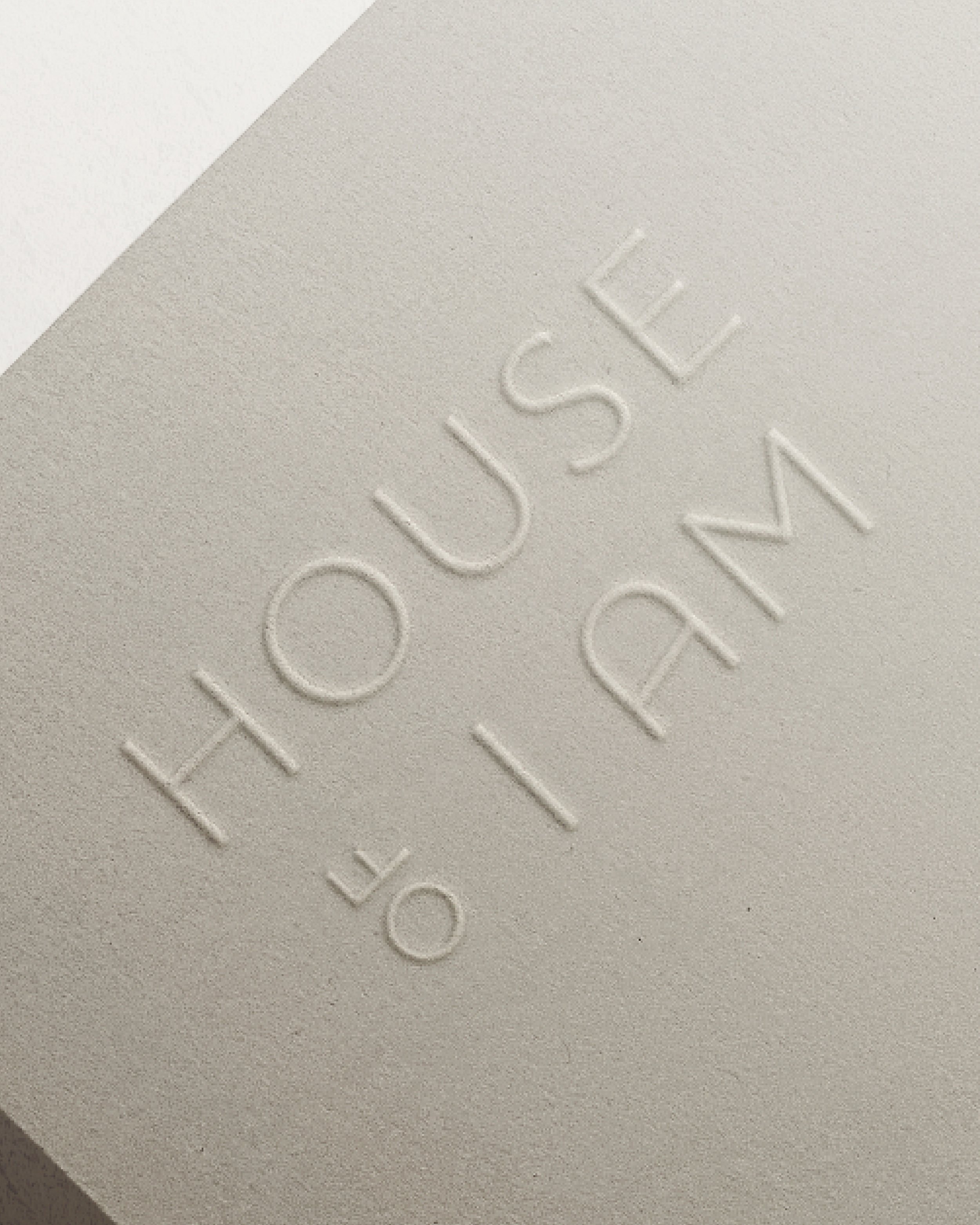
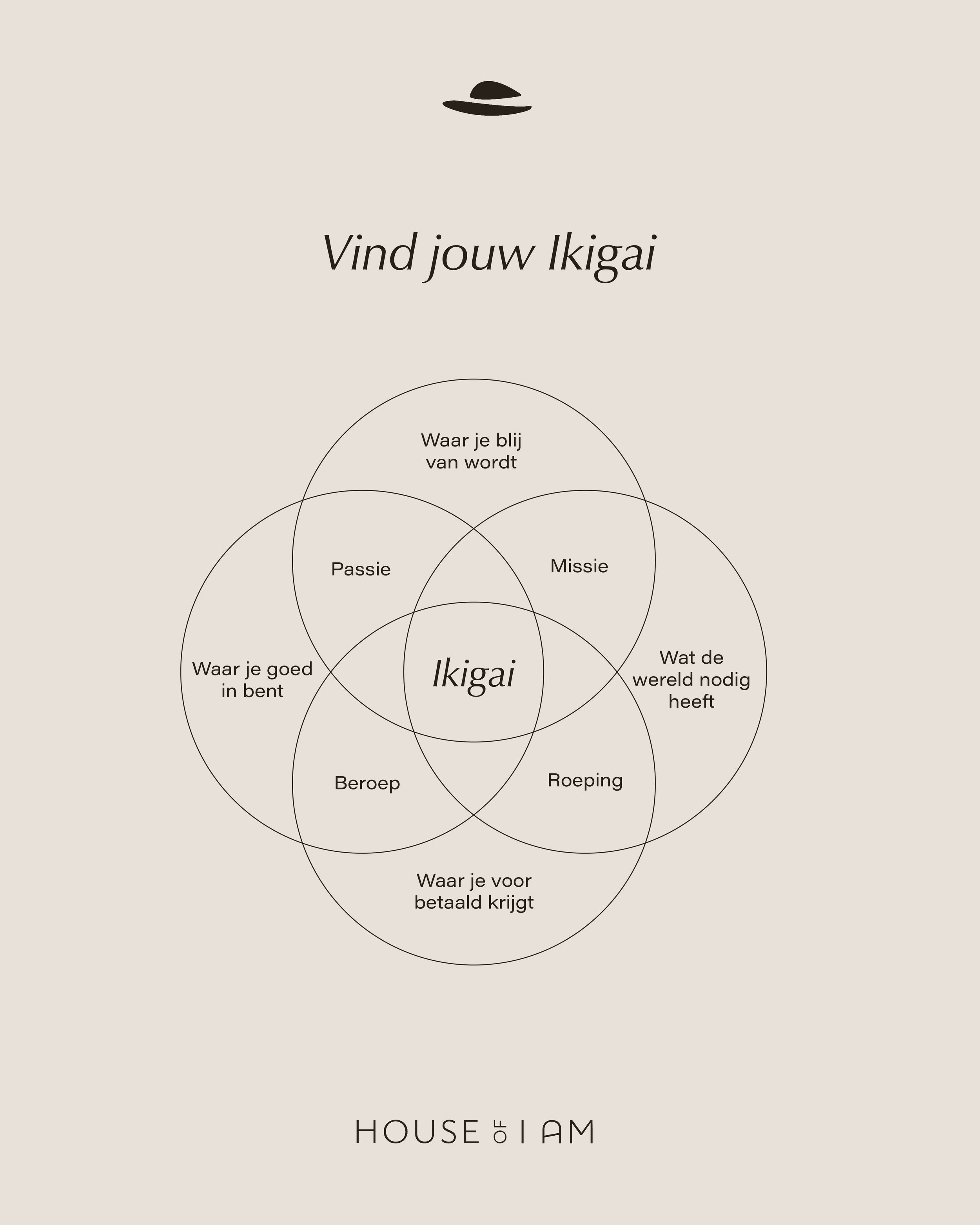
IAMAUREEN became House of I Am. A fitting and inspiring continuation of what Maureen has built up in recent years. A new vision and visual identity for the coming years. Together we delved into her brand purpose, brand values and brand story, in which the philosophy of Ikagai played a leading role. Slowly the design came about, a logo with Japanese influences. The influence of Ikagai can be found throughout the entire Visuals identity, from the earthy colours, the tranquility, the matching fonts and the graphic elements. We completed the project with a social strategy and design.






How we transformed House of I Am
We worked alongside Maureen to transition her established brand, IAMAUREEN, into the next chapter as House of I Am. Together, we defined a new vision by diving deep into her core values and anchoring the brand strategy in the philosophy of Ikigai. This Japanese influence naturally shaped the visual identity, inspiring a clean logo, earthy color tones, and minimalist graphic elements that bring a sense of calm to the brand. We wrapped up the transformation with a cohesive social media strategy and design system, creating a grounded, purposeful presence that honors what she built while preparing the brand for the future.
-
Cafe Auguste
August, 2025
-
Ligne
March, 2025
-
House of I Am
March, 2024