
BYFREY
Branding / Visual Identity
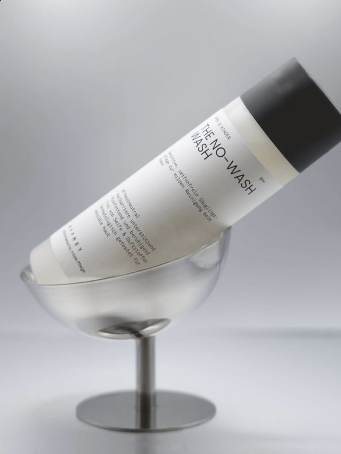
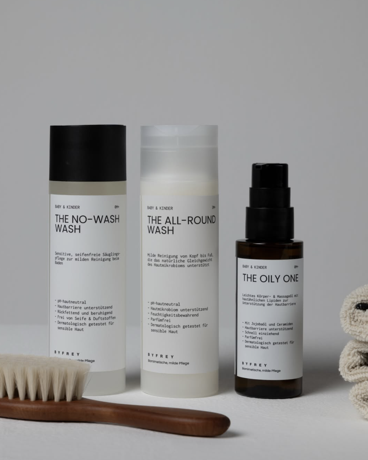
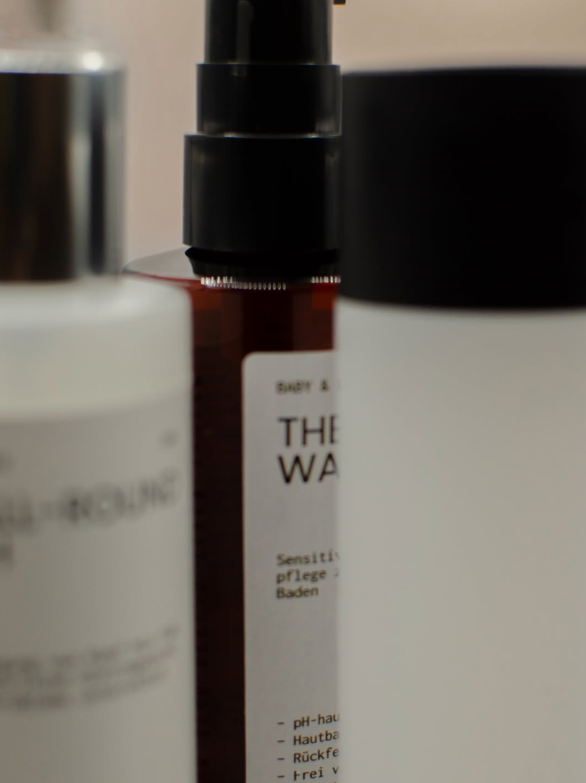
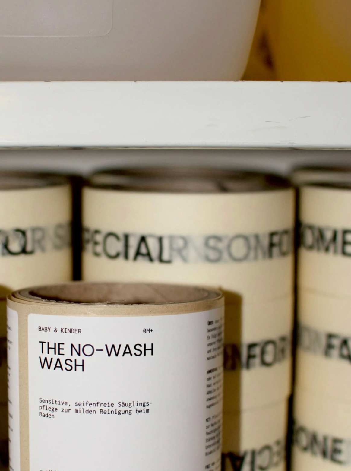
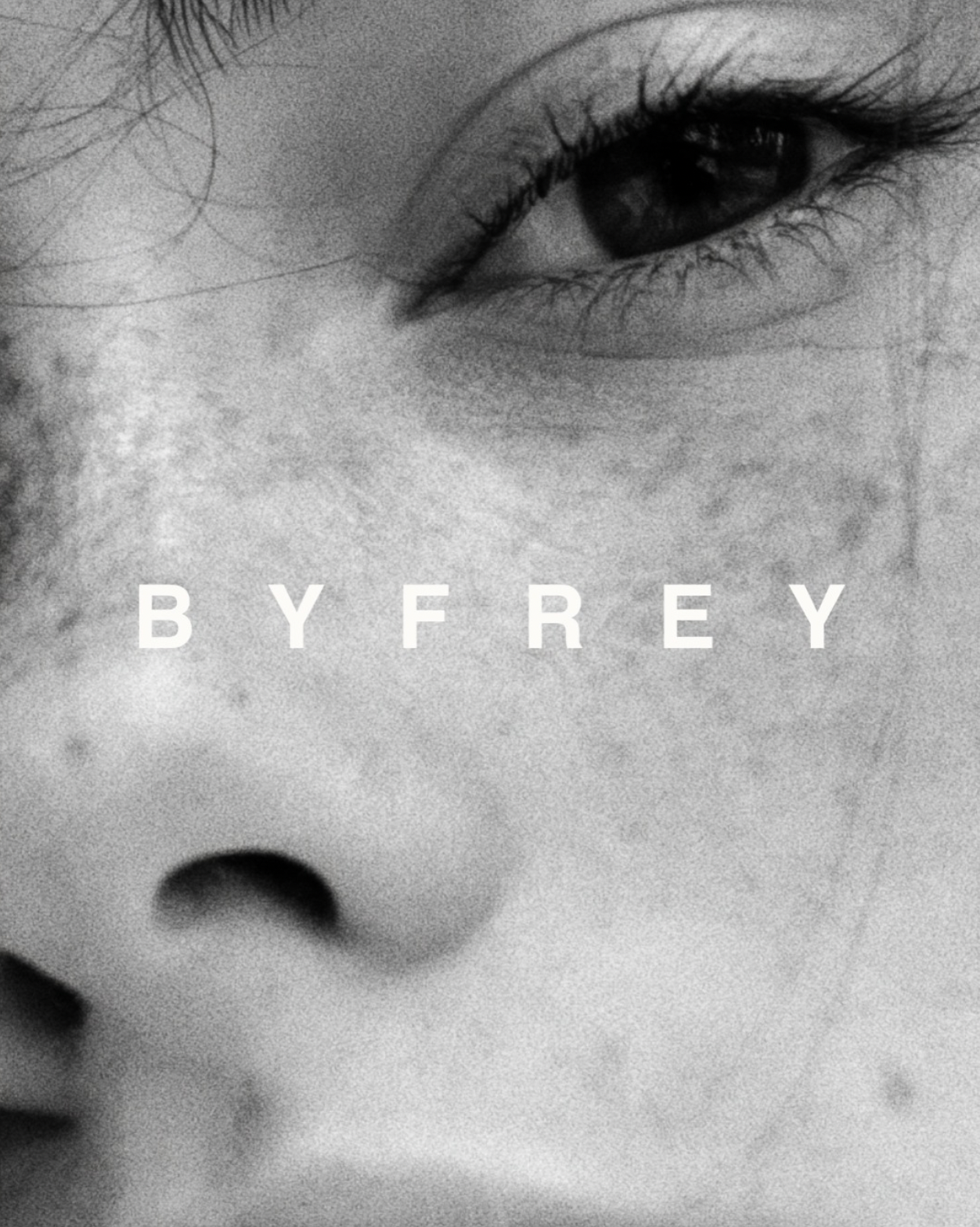
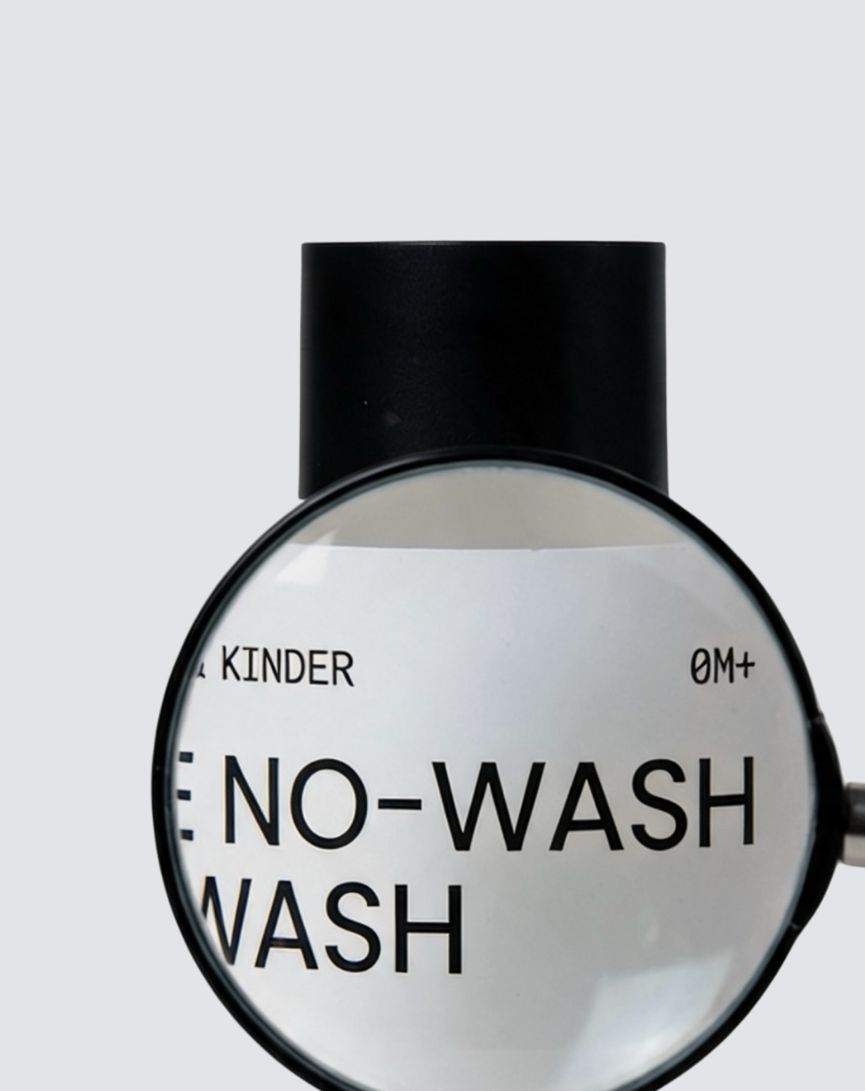
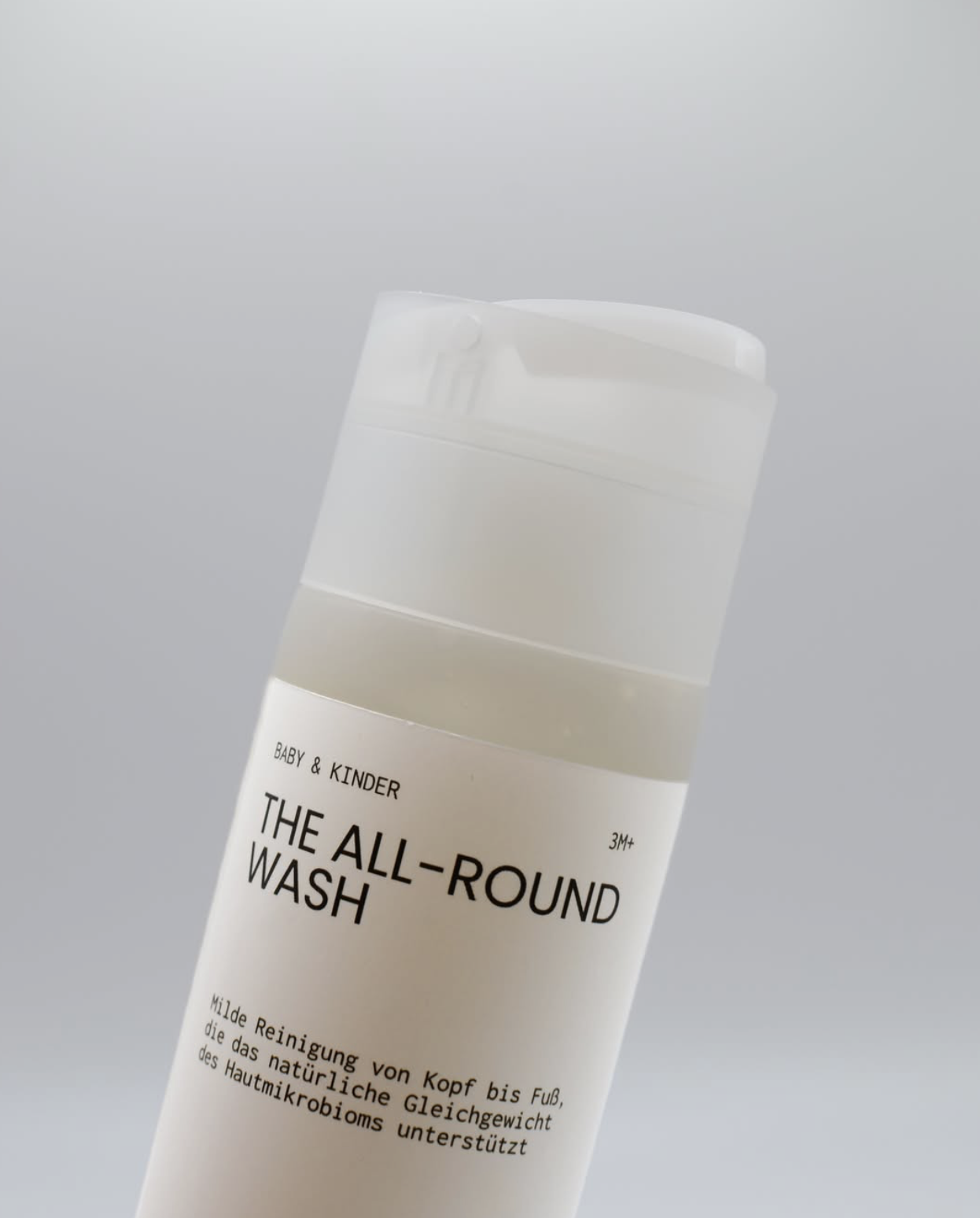
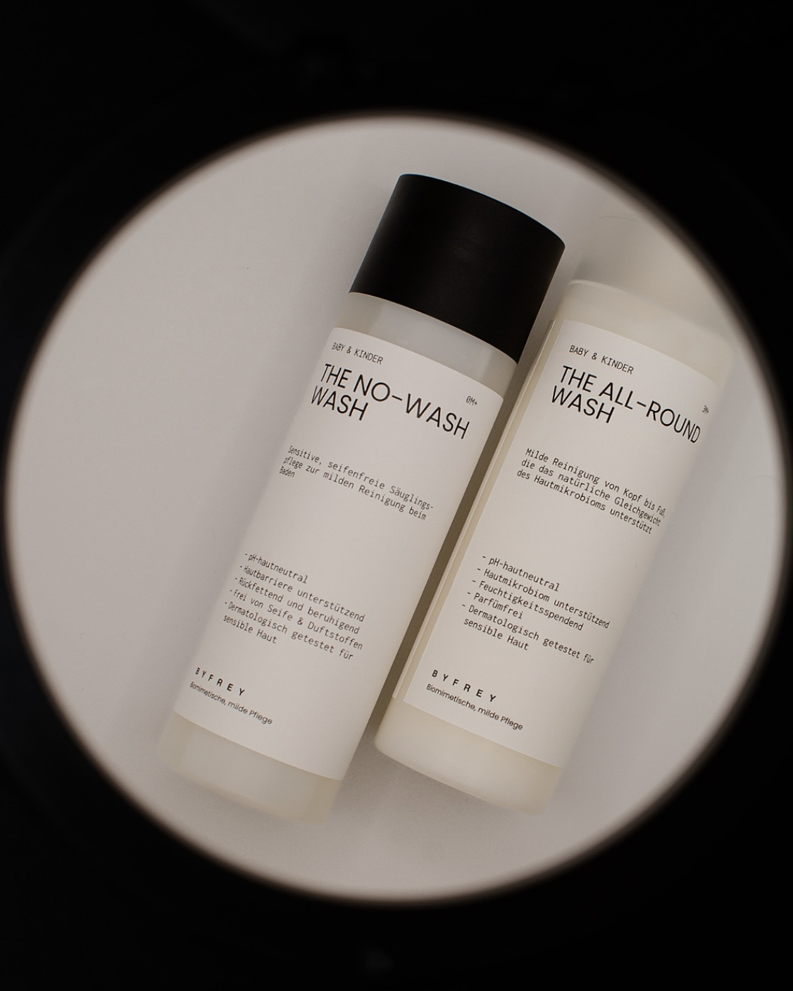
We created the brand identity for BYFREY, a hair and body care brand for childeren rooted in over 60 years of family expertise in cosmetics. Founded by Freya, who grew up around her family’s production business in Germany, BYFREY brings a new perspective to mild, science-led care for sensitive skin. The identity balances clarity with warmth, combining a bold sans serif with a humanist monospaced typeface and a muted palette of earthy browns, off-white, black and soft greens. The result is a considered visual language that feels trustworthy and approachable, giving a new generation of care a distinct personality.

How we transformed BYFREY
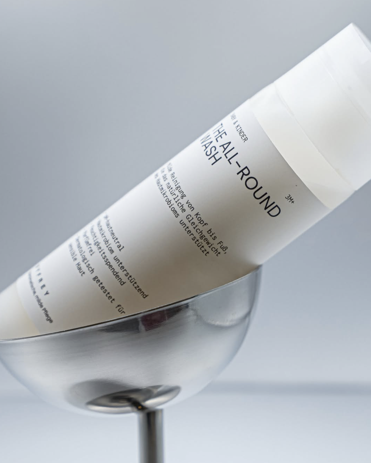
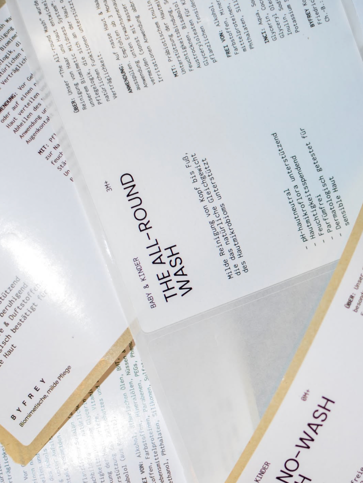
For BYFREY, we developed a visual identity that brings together scientific precision and a more human approach to hair and body care. The typography pairs a bold sans serif with a humanist monospaced font, while a muted, natural colour palette adds warmth and depth.
Whitespace gives the identity room to breathe, while the packaging becomes a canvas for storytelling. From product labels to wrapping paper, each element serves a purpose, making information clear and the everyday experience of care feel thoughtful and considered.
-
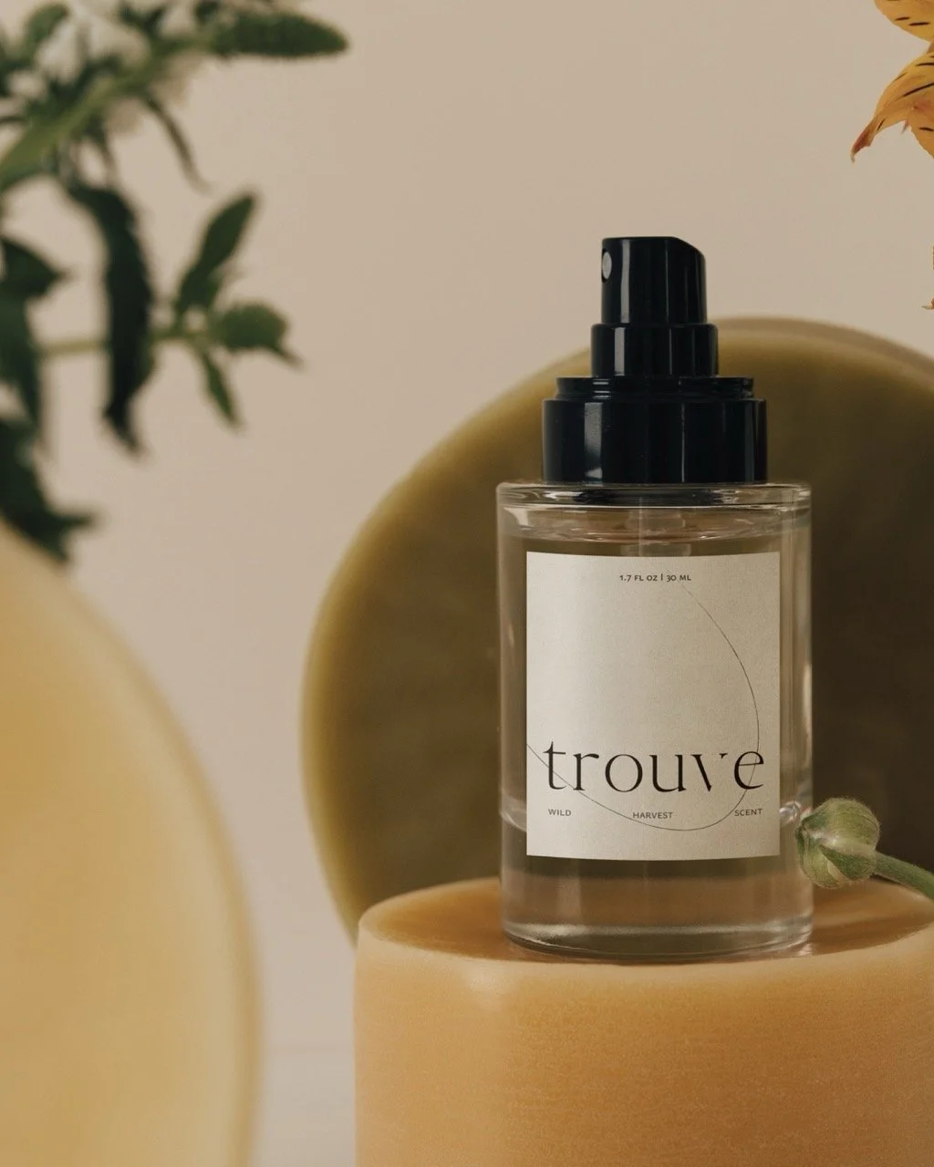
Trouve
Jan, 2025
-
Ligne
Mar, 2025

-
Uniform Coffee
Dec, 2025