Uniform Coffee
Branding / Packaging / Socials
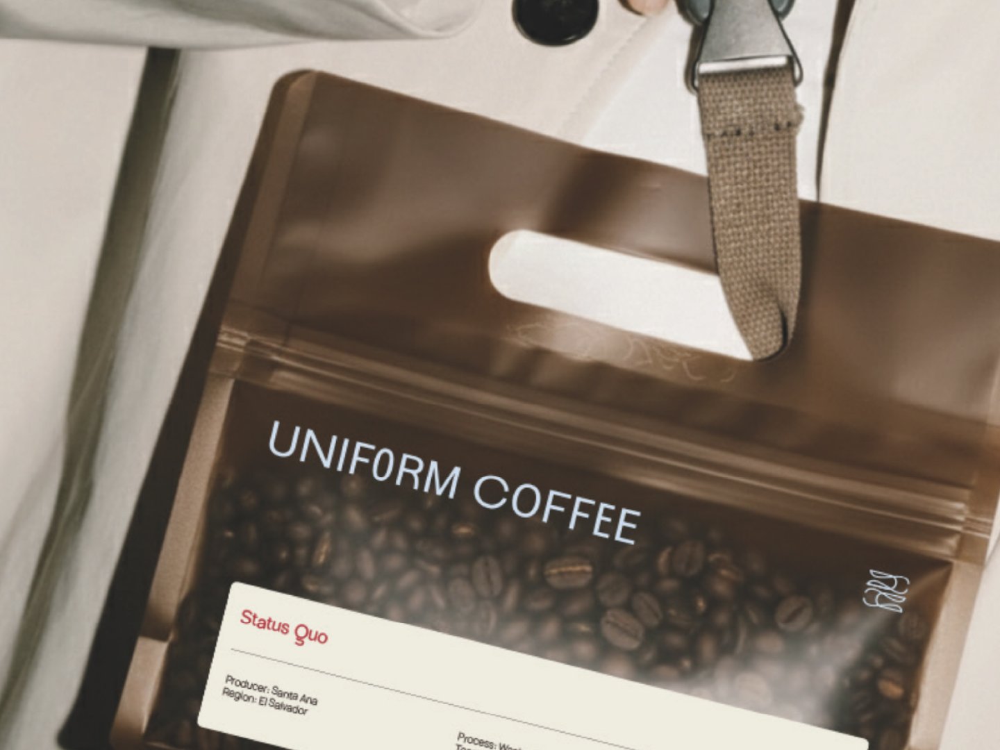
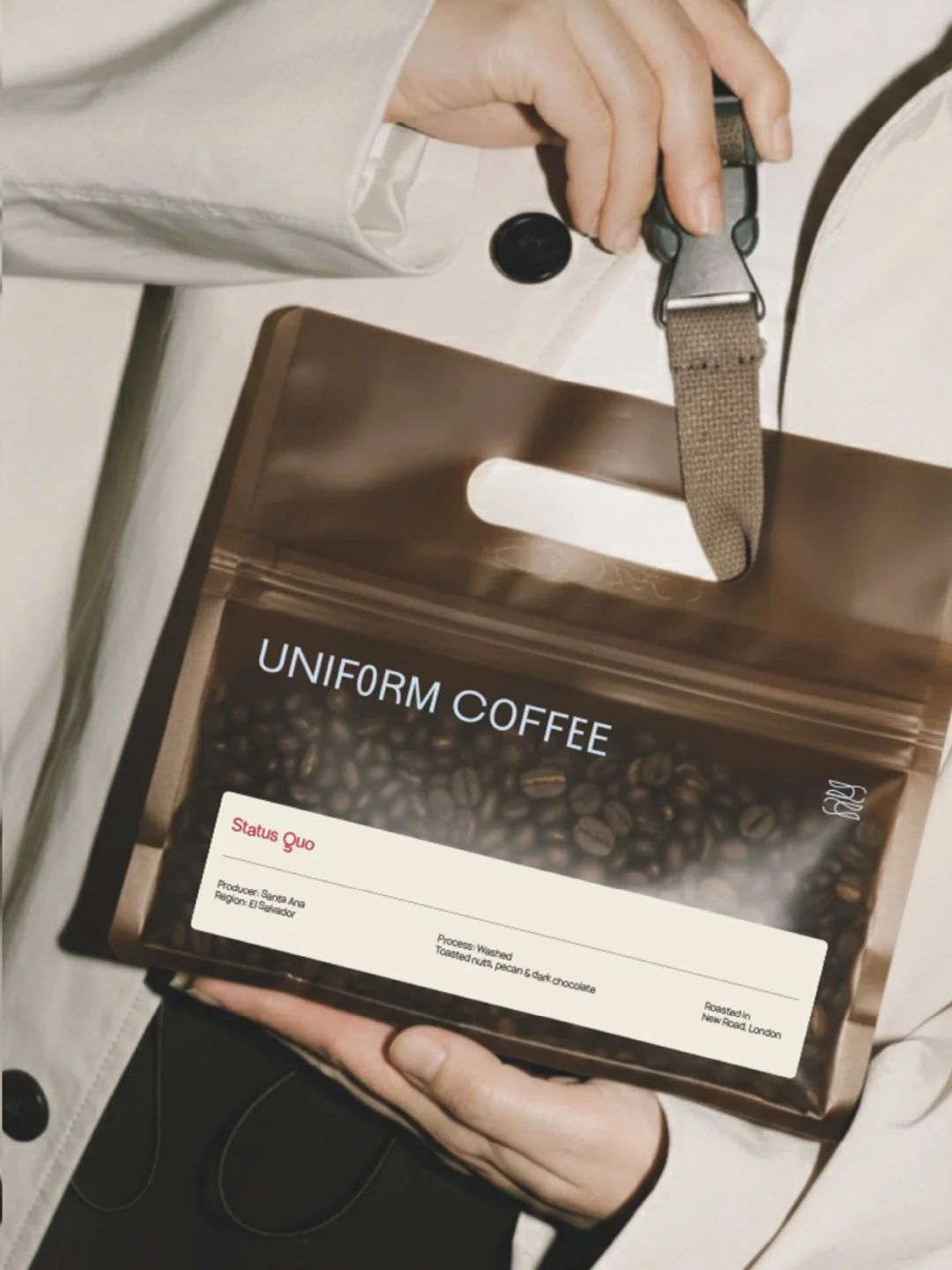
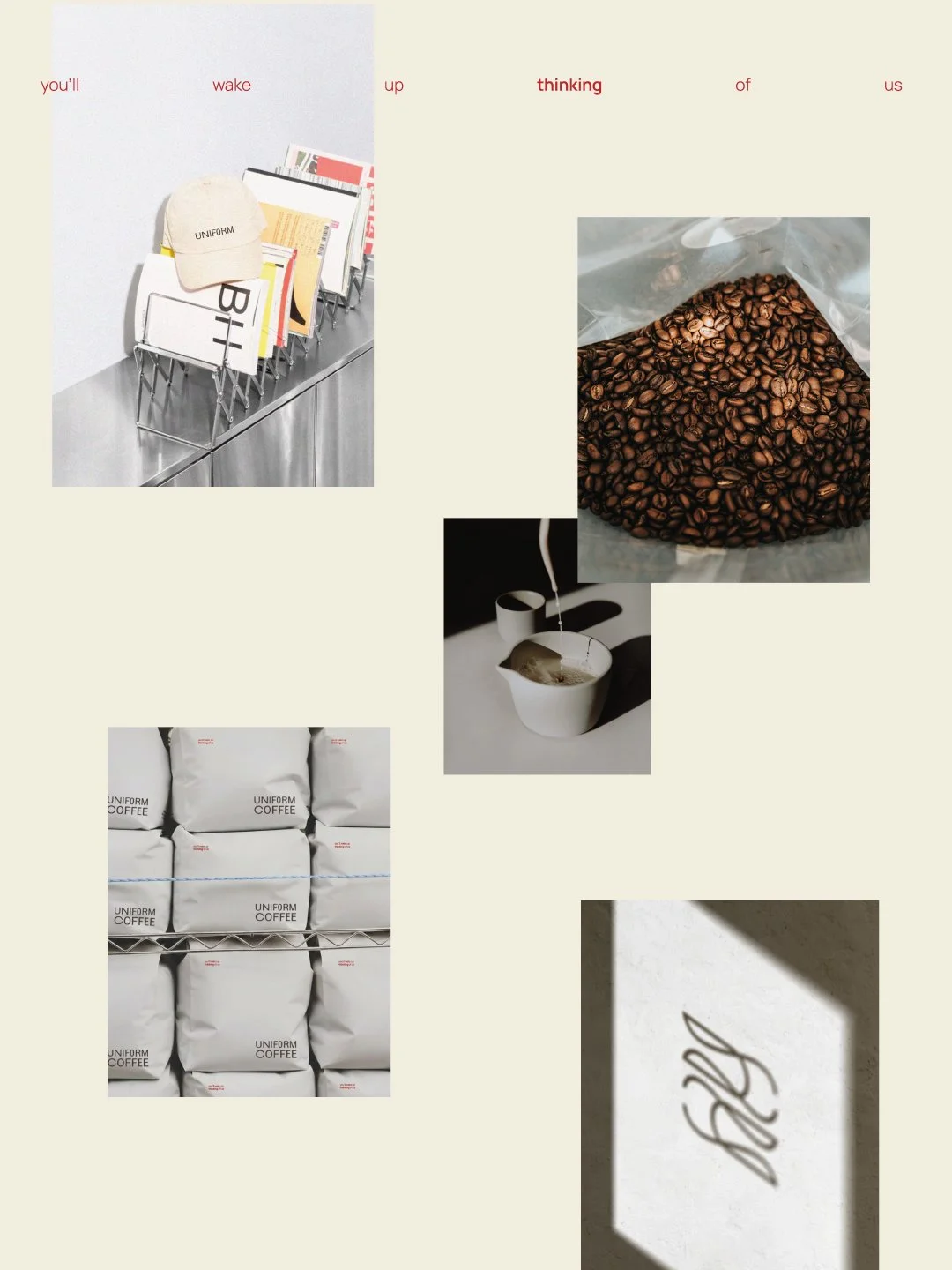
Uniform Coffee (London) was built on a simple philosophy: great coffee should be consistent and quietly exceptional. Born in London and rooted in old-school values, the brand is driven by modern flavor. Every roast is guided by precision, and taste, no shortcuts, no compromise. Just coffee done properly, day after day. The visual identity is designed for those who curate their lives with intent, treating the coffee ritual as an architectural foundation for the day. By stripping away the unnecessary, the aesthetic finds its strength in a look that feels professional, yet holds the creative edge of a high-fashion house.

How we transformed Uniform Coffee (London)
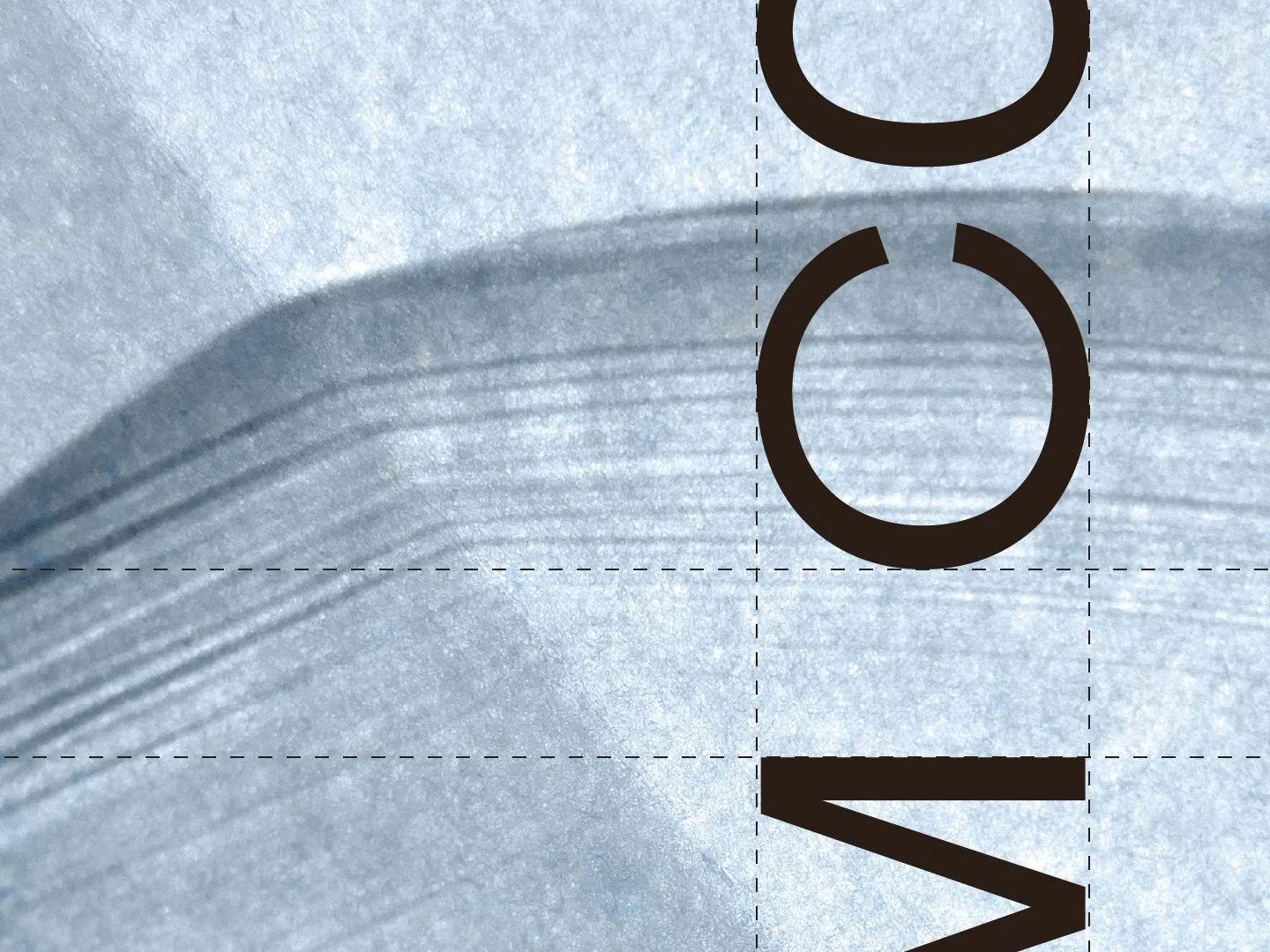
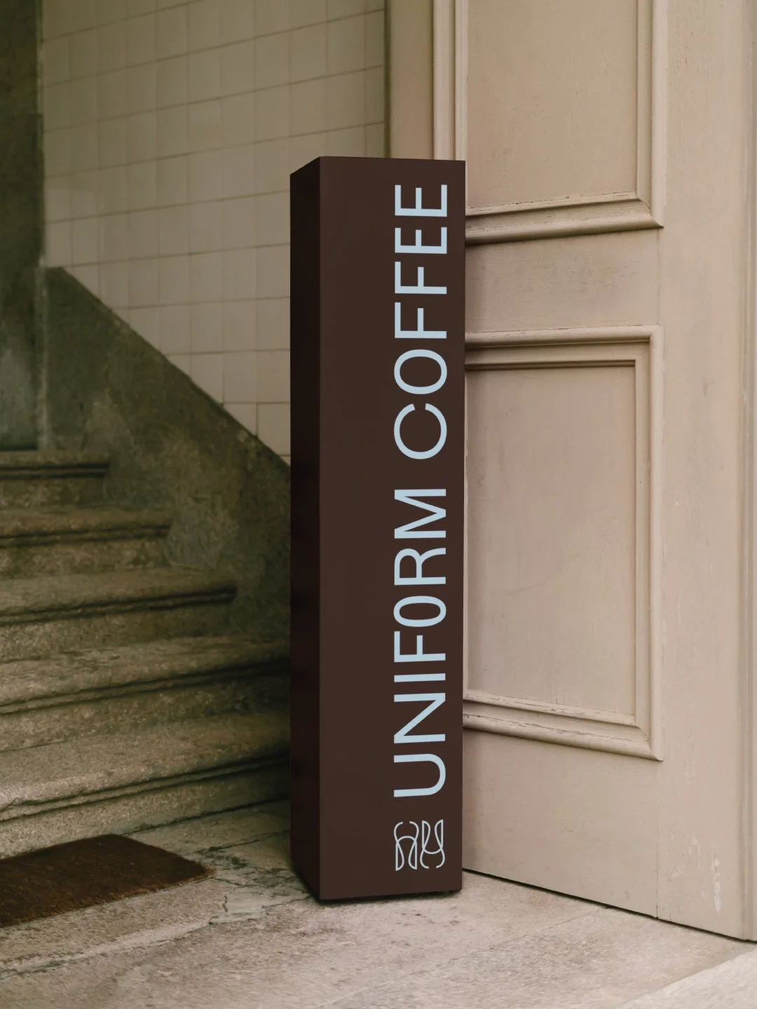
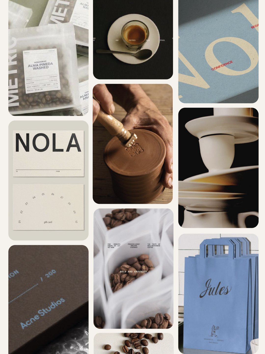
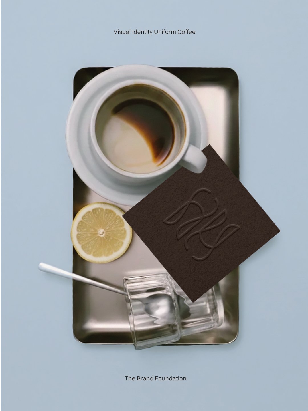
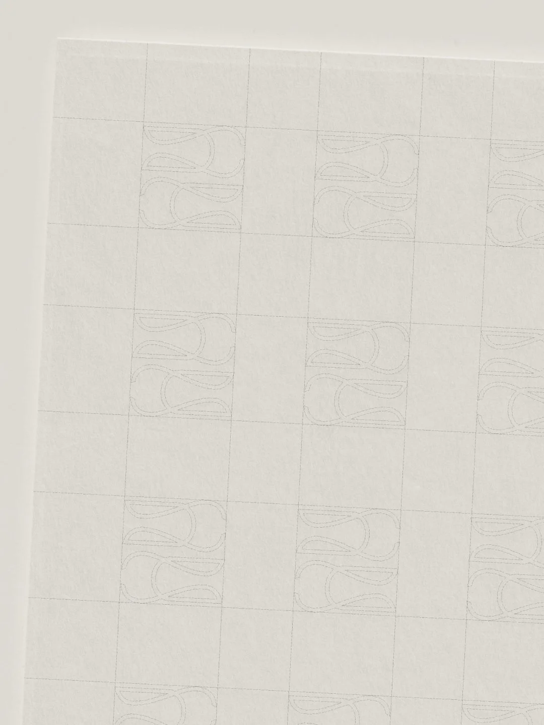
We brought Uniform’s philosophy of discipline and consistency to life through a clean and bold visual identity. The design centers on a rhythmic sans-serif typeface where every letter balances the next, mirroring the idea of refining a craft until only the essentials are left. To give the brand a tactile, high-end feel, we paired warm browns and off-white linen with a modern blue, using milky transparencies to add depth. A sharp pop of bright red breaks up the neutral tones, adding a hit of modern energy. The final result is a structured, confident brand identity that feels both professional and effortlessly creative.
-
Cafe Auguste
August, 2025
-
Ligne
March, 2025
-
House of I Am
March, 2024