De Keizersnede Club
Branding/Packaging/Campaign
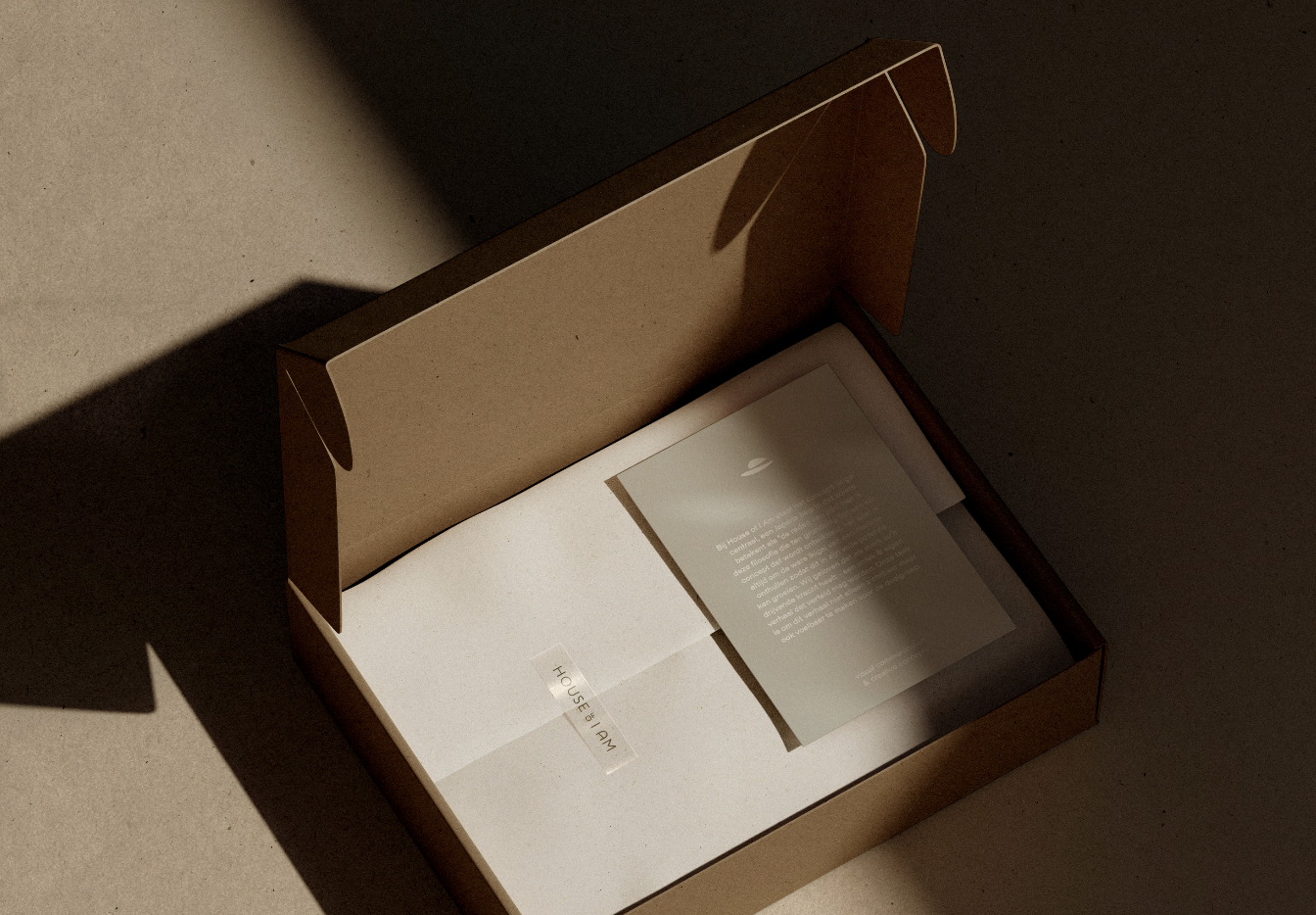
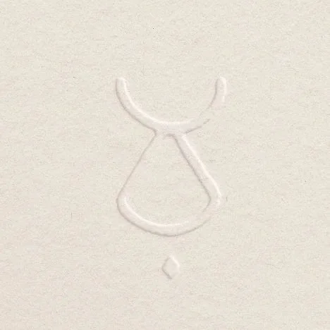
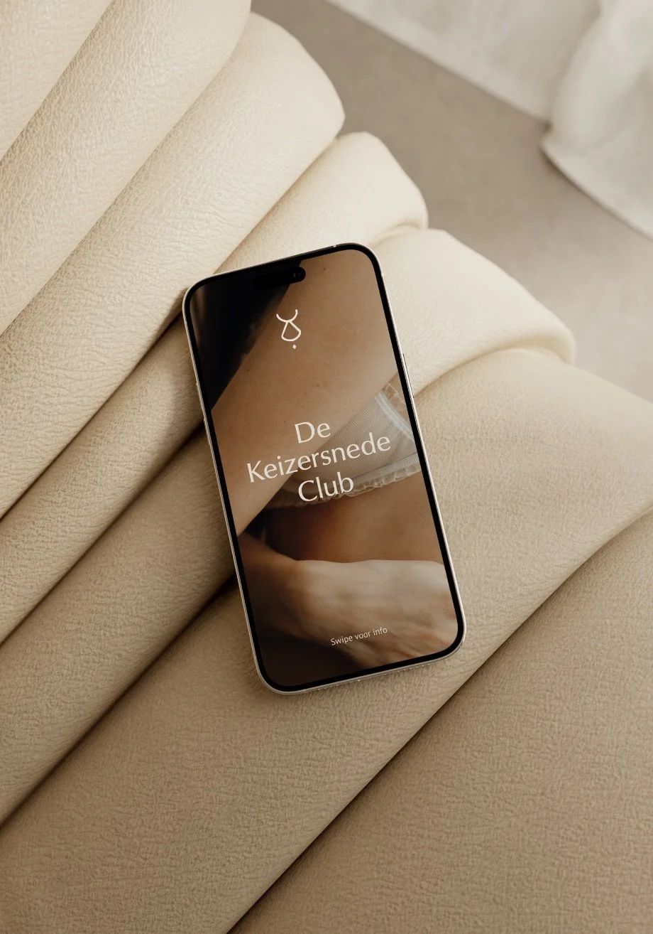
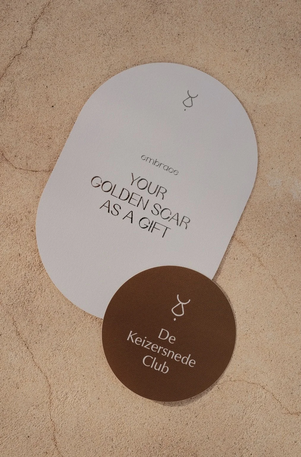
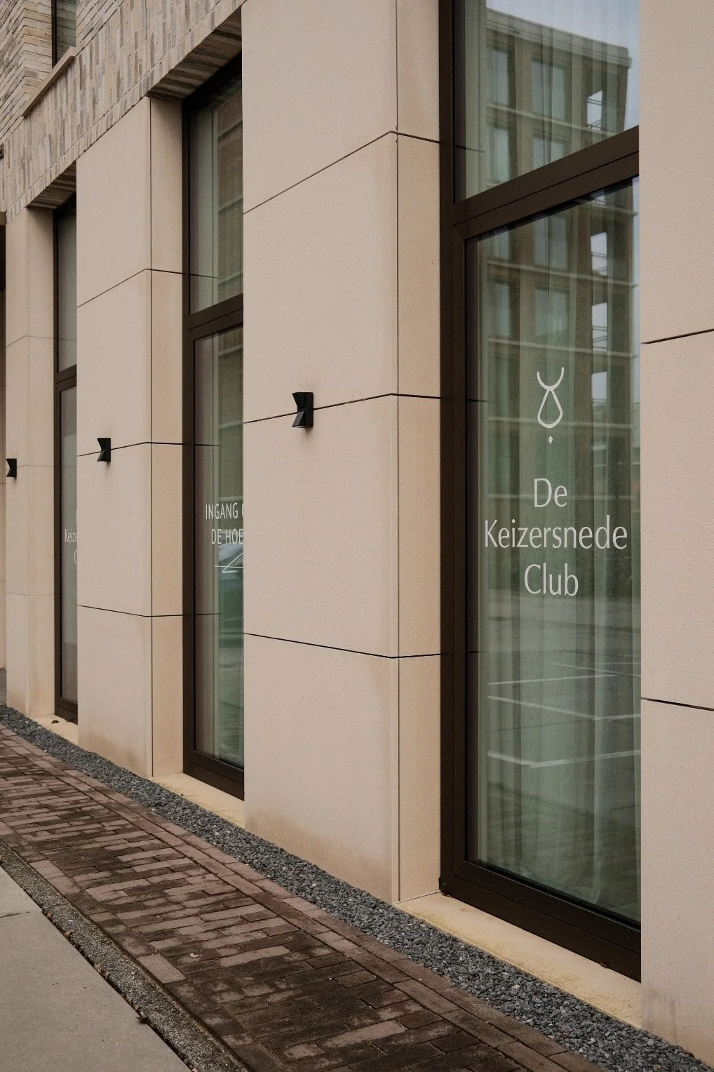
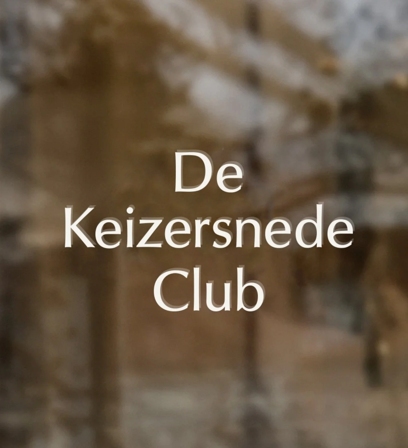
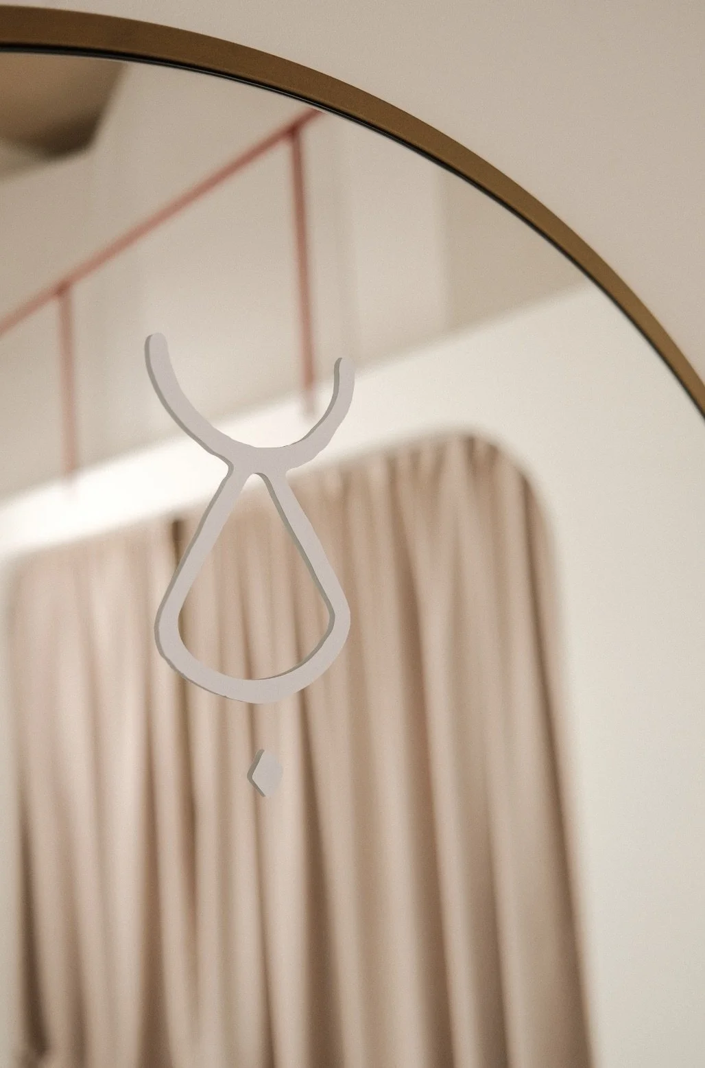
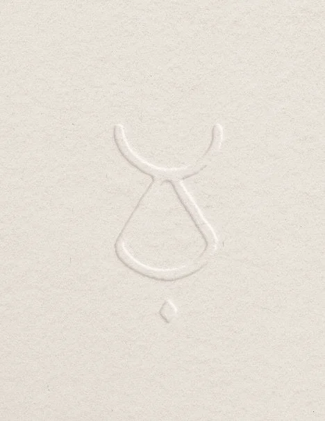
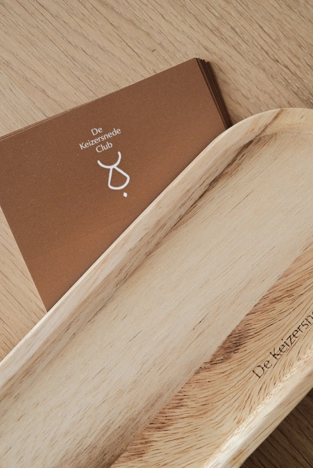
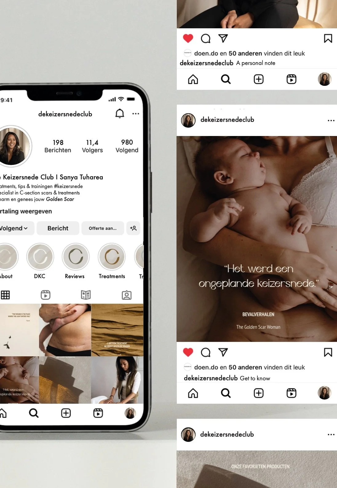
Sanya and I met through our collaboration for an Instagram Glow-Up. It was a huge compliment when she asked us to design her logo and monogram and give her brand more depth. For De Keizersnede Club we were looking for a logo that exudes professionalism, femininity, elegance, timelessness and simplicity. At the same time we wanted the icon to have a hand-drawn feel (it was ultimately completely hand-drawn) with an abstract look and feel, with the letters D, K and C reflected in the monogram. In 2024 we’ve added the creative direction for a video + photoshoot, the photography itself and packaging + giftcard design.
How we transformed De Keizersnede Club
We partnered with Sanya to bring more depth to De Keizersnede Club, evolving our initial Instagram collaboration into a complete brand identity. We designed a logo system that balances professional credibility with a soft, elegant femininity. The heart of the brand is a completely hand-drawn, abstract monogram that subtly weaves together the letters D, K, and C. Later on, we expanded this visual world by leading the creative direction and photography for their video and photoshoot, while also designing their custom packaging and gift cards. The final result is a timeless, cohesive presence that feels deeply personal yet fully established.
-
Cafe Auguste
August, 2025
-
Ligne
March, 2025
-
House of I Am
March, 2024