Isvara
Branding/Packaging/Social Media
We were responsible for developing the branding for Isvara - Ayurvedic Wellbeing. This included creating the brand name and designing the visual identity. The inspiration for the logo came from the symbol used by old pharmacists, who often incorporated a snake into their signage. We modernized this concept by incorporating an 's' from Isvara and the idea of 'the earth as our medicine' into the brand mark.


How we transformed Isvara
We built the entire foundation for Isvara - Ayurvedic Wellbeing from the ground up, starting with the development of the brand name and followed by a complete visual identity. For the logo, we drew inspiration from traditional pharmacy signage and modernized the classic snake symbol, shaping it into the 'S' from Isvara to reflect the idea of the earth as medicine. To bring the brand world to life, we directed a visual story that feels both grounded and premium, with photographer Jitske Hagens from Wij Zijn Kees capturing the photography on location in Portugal. The final identity beautifully balances historical wellness roots with a clean, contemporary aesthetic.
-
Cafe Auguste
August, 2025

-
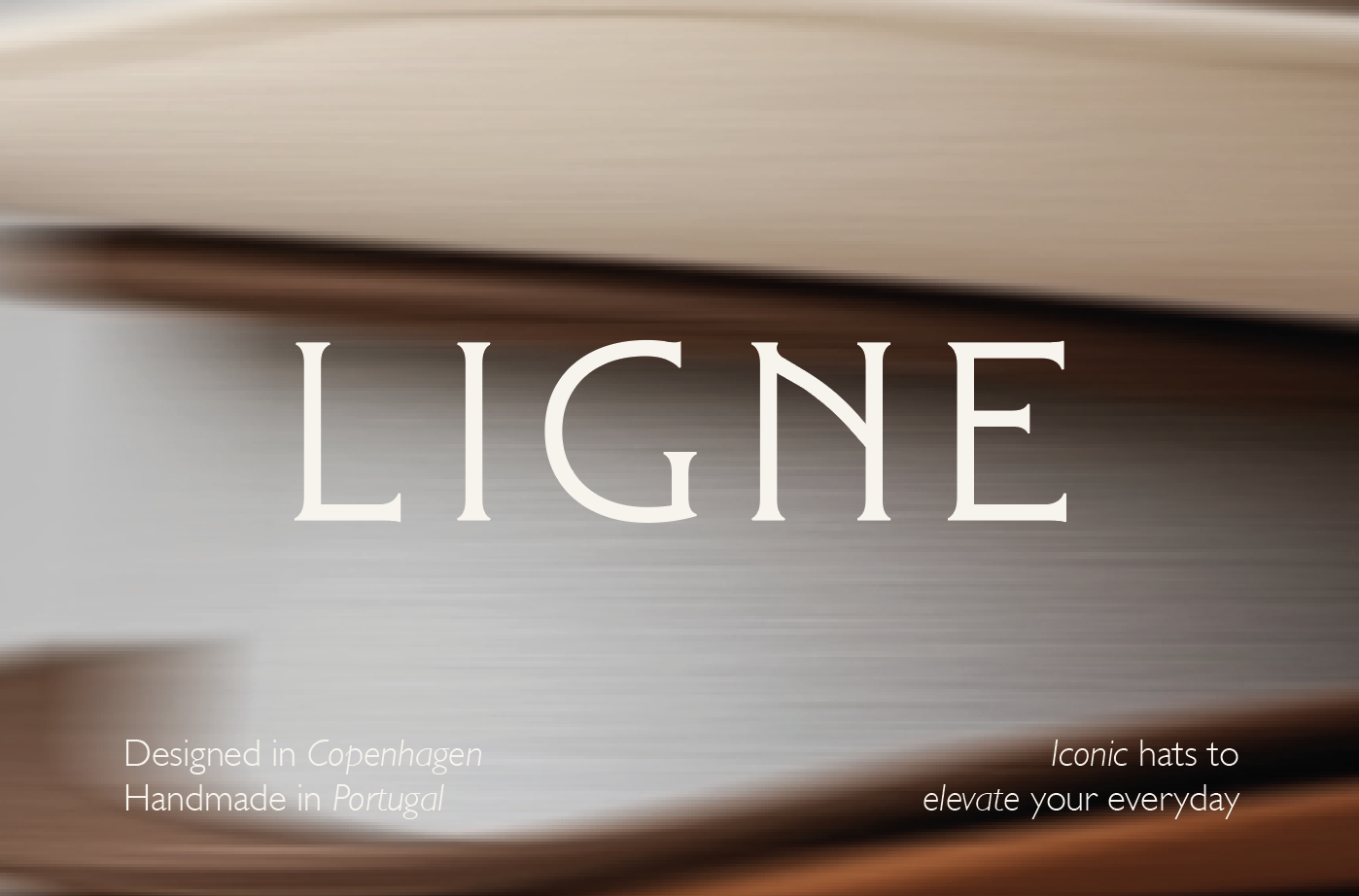
Ligne
March, 2025
-
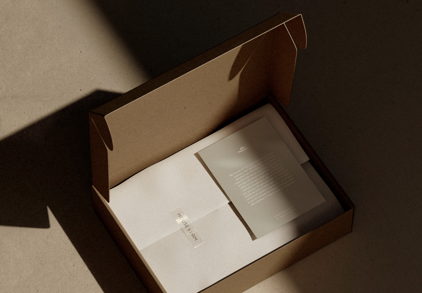
House of I Am
March, 2024