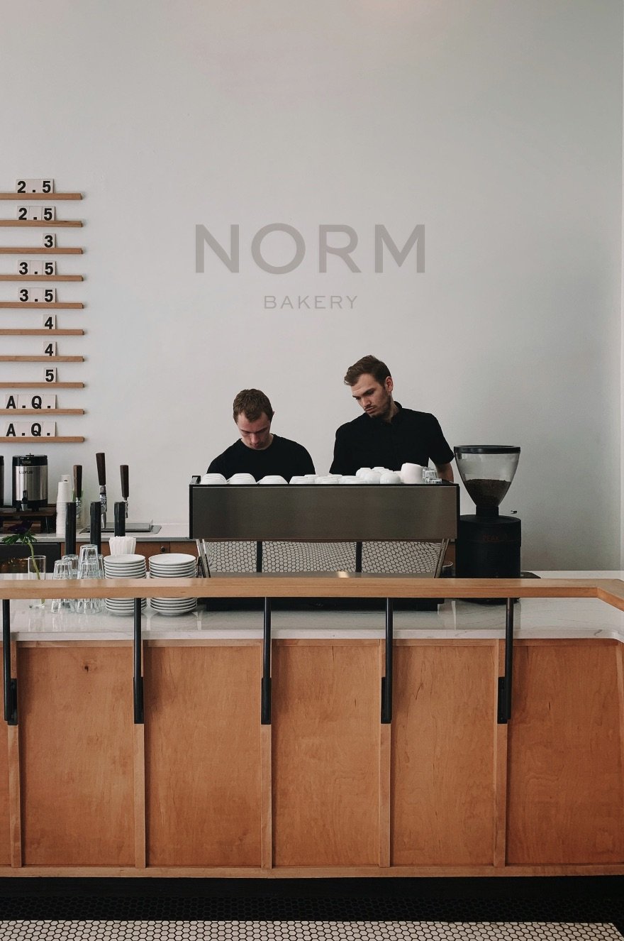
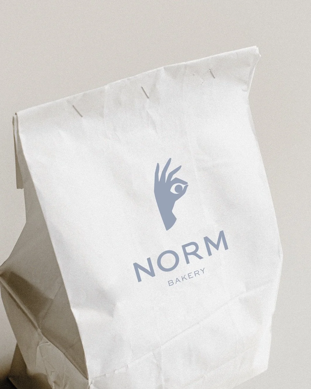
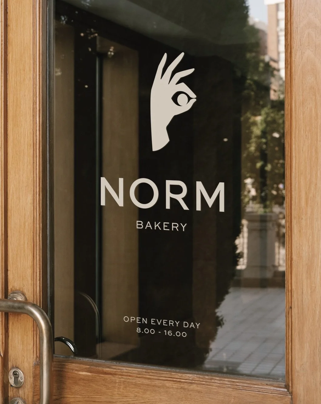
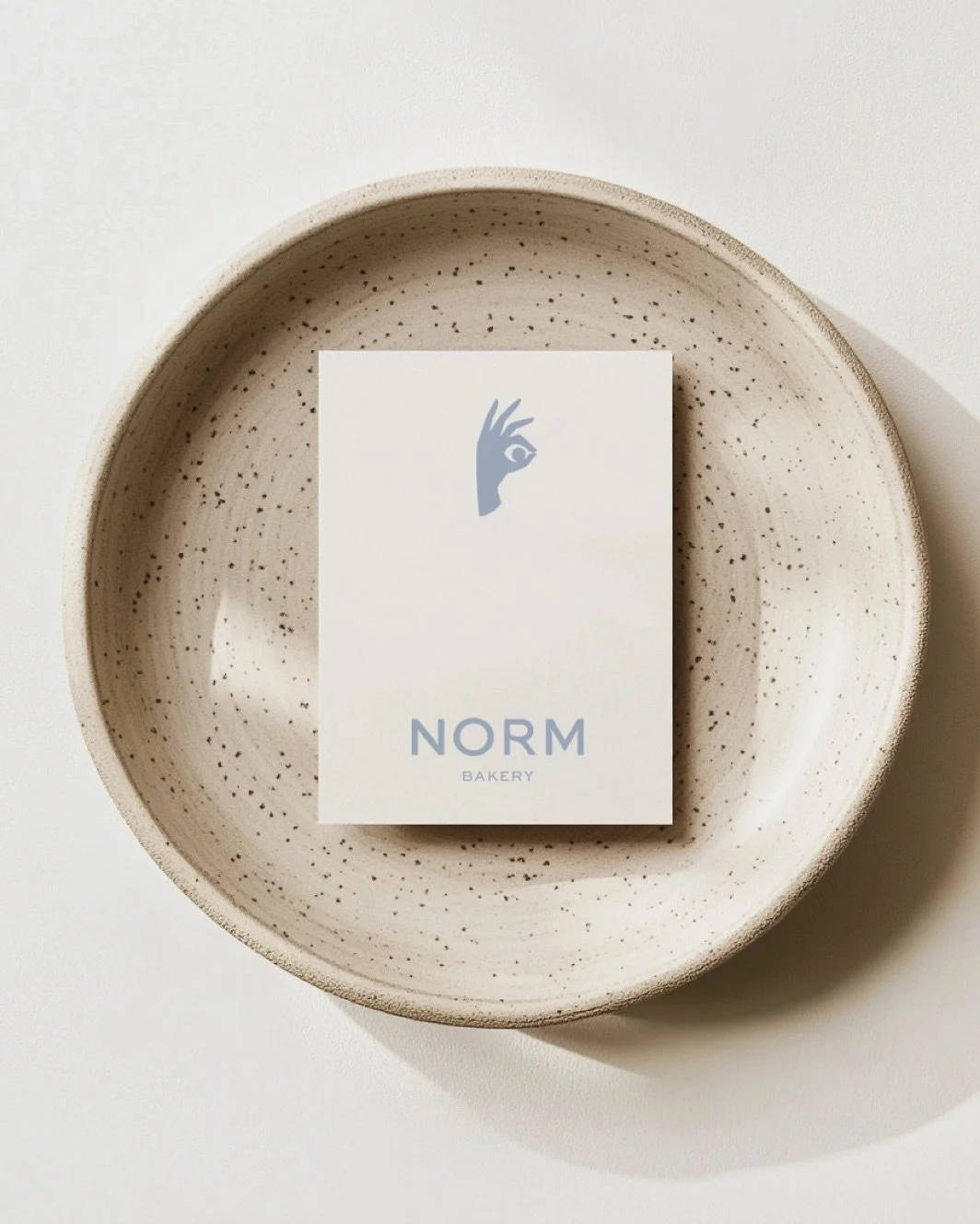
Norm Bakery
Branding/Packaging
A coffee place and bakery focused on artisanal sourdough bread and pastries while bringing people together. The design philosophy behind Norm is rooted in simplicity and warmth. The logo has clean nordic shapes with a soft rounding which comes back in the hand drawn brand icon. The colors of the brand exist of browns and a pop of light blue to give it a light and less serious approach, while maintaining the clean brand identity.

How we transformed Norm Bakery
We took Norm Bakery's focus on artisanal craftsmanship and translated it into a warm, inviting brand identity. By combining clean Nordic shapes with a soft, hand-drawn icon, we gave the specialty coffee and sourdough concept a grounded, human feel. We balanced the clean aesthetic with a thoughtful color palette, using rich browns to reflect the bakery's roots paired with a pop of light blue to keep the overall identity approachable and lighthearted. The final result is a distinct, welcoming visual world that positions Norm not just as a bakery, but as a central community gathering place.
-
Cafe Auguste
August, 2025
-
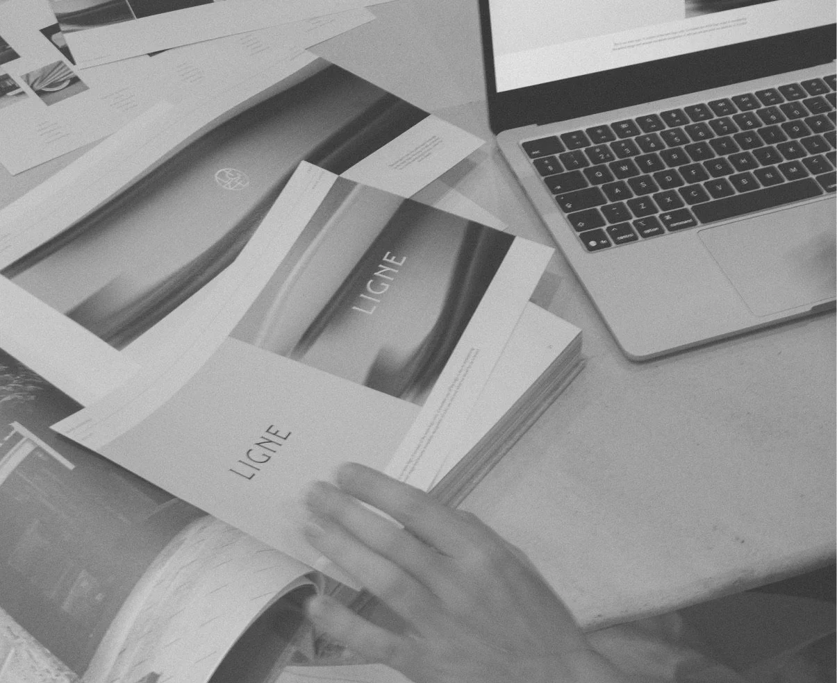
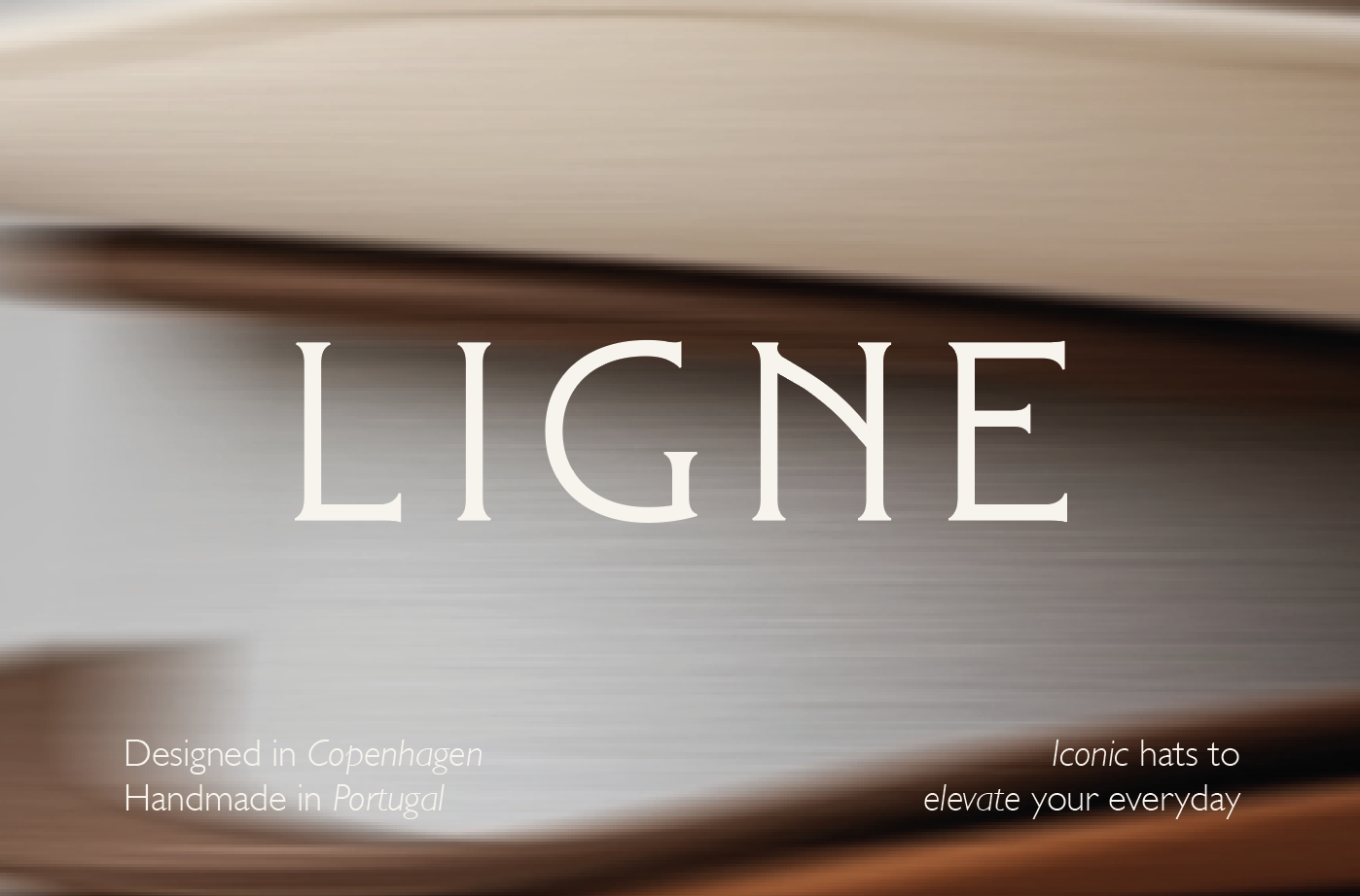
Ligne
March, 2025
-
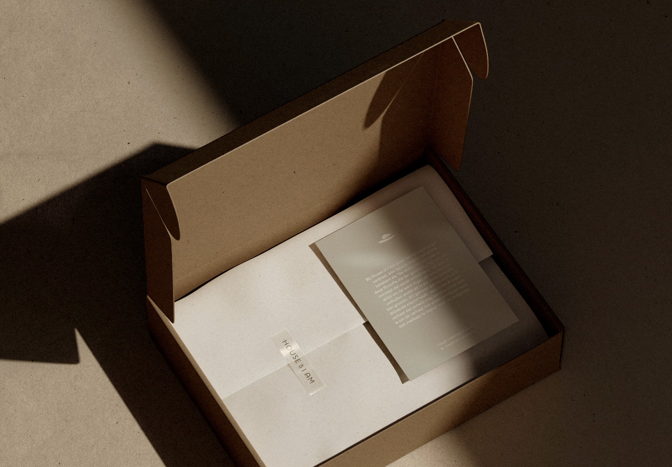
House of I Am
March, 2024