Youlife
Branding / E-books
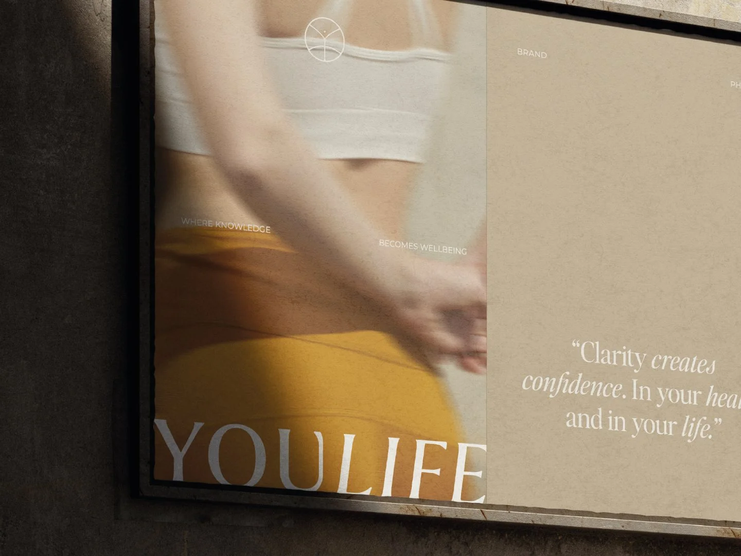
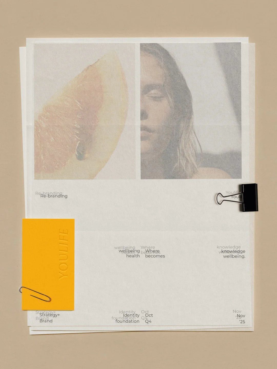
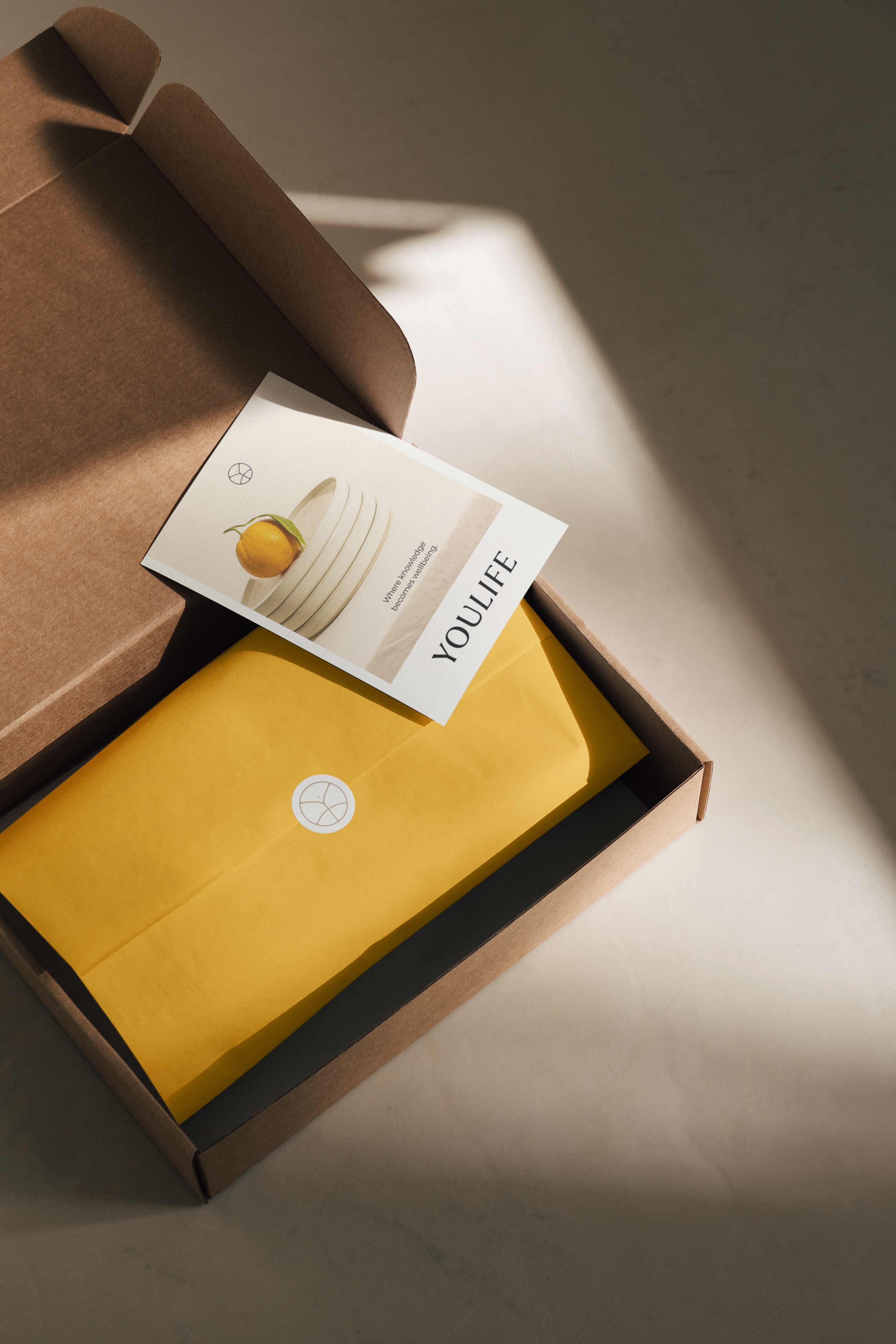
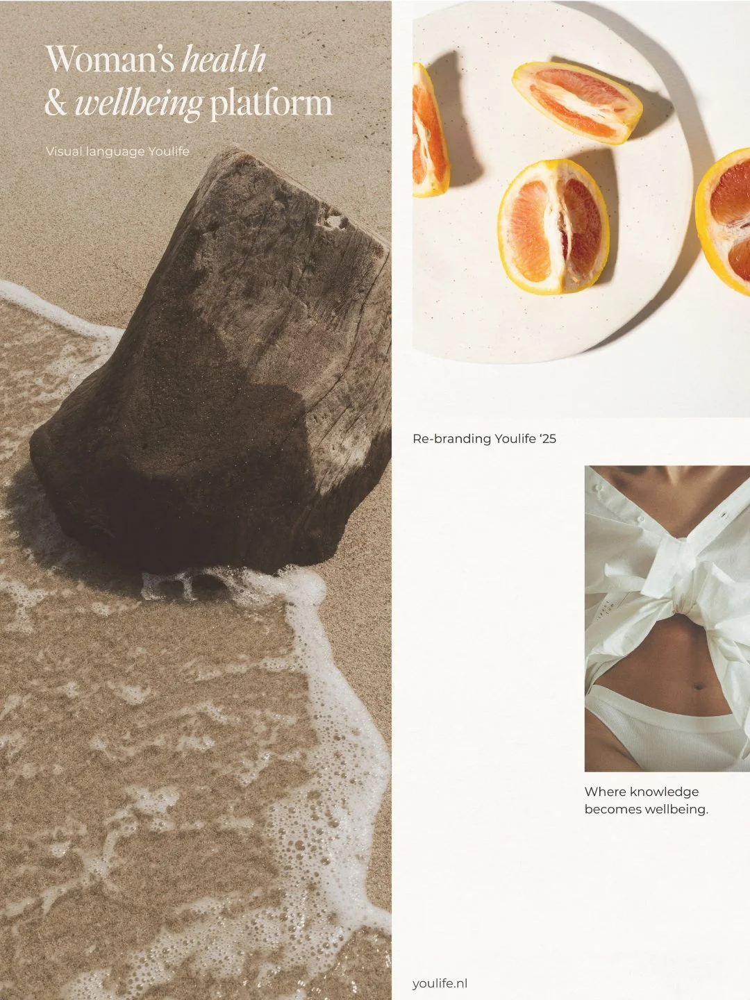
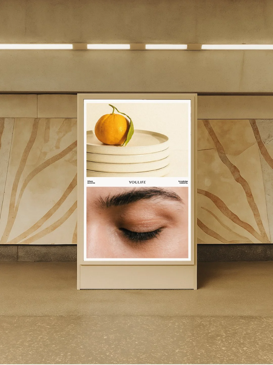
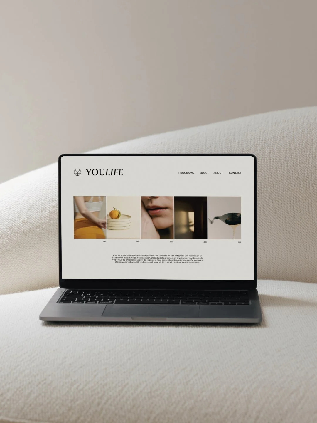
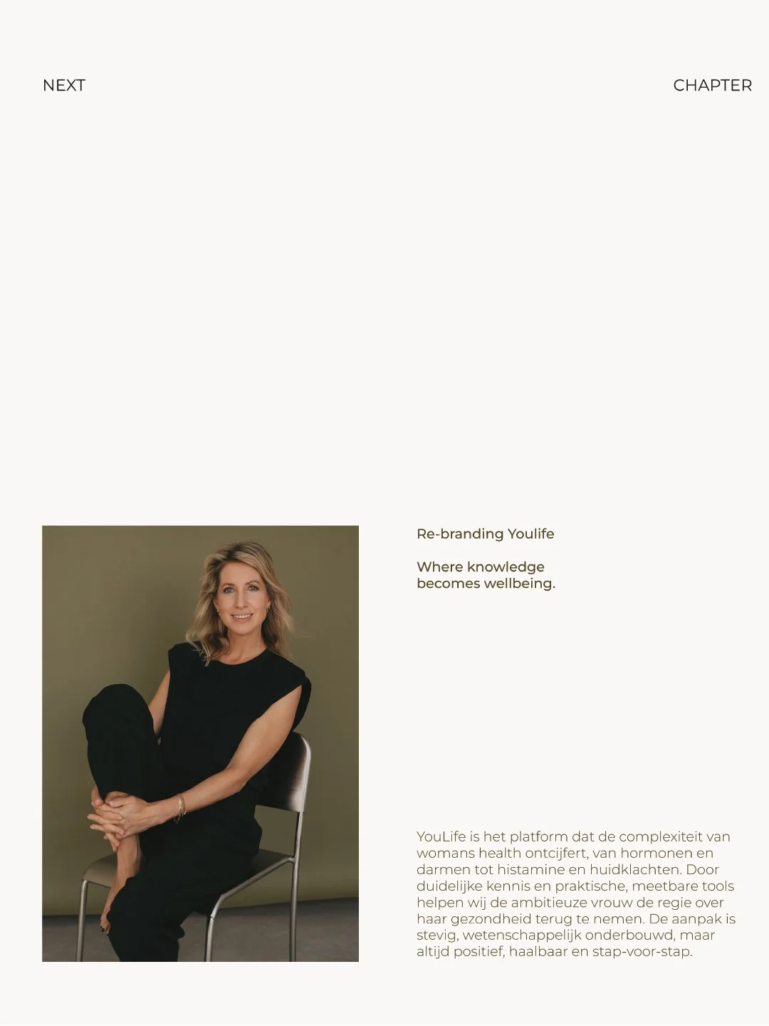
We created a new visual vocabulary for YouLife, a women’s health brand rooted in the belief that the body is not a problem to be solved, but a system to be understood. The branding translates this philosophy into a grounded and optimistic identity. By pairing a bright, energetic vitality yellow with a soft, circular design language, the visual system establishes a welcoming space dedicated to clarity and a positive approach to health.

How we transformed Youlife
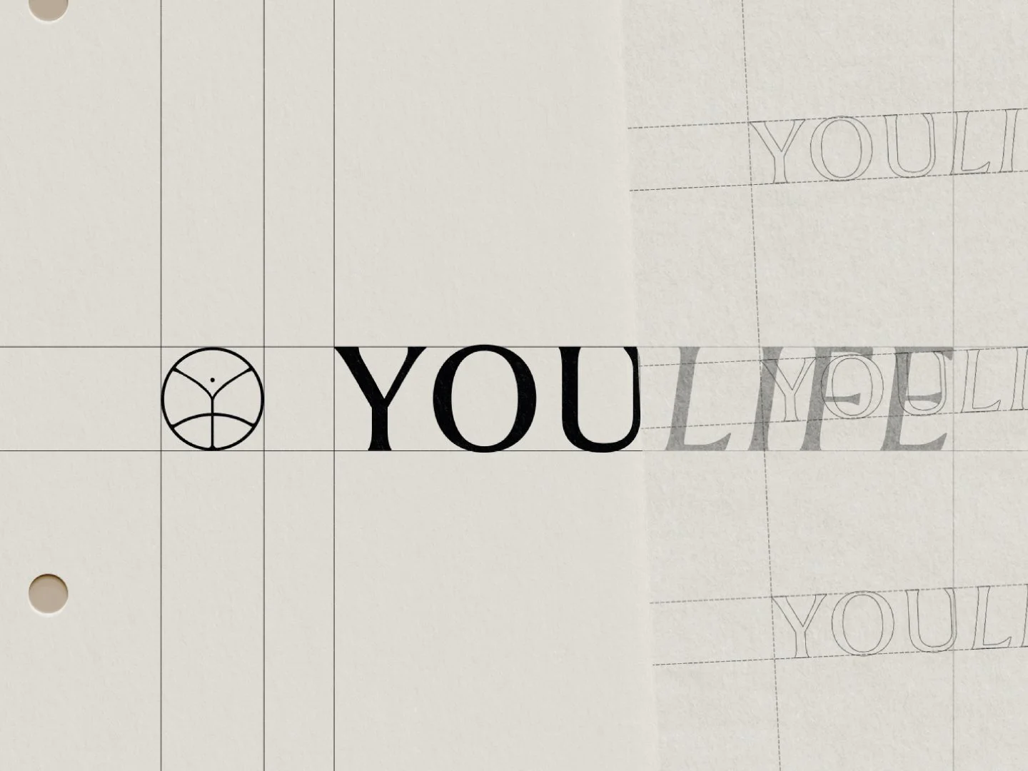
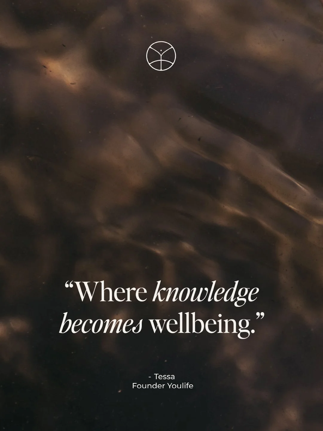
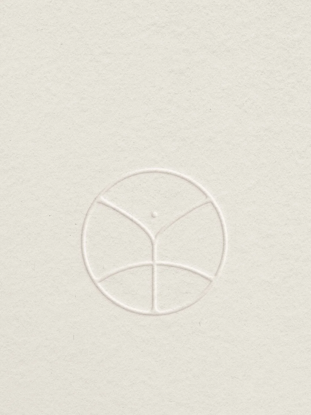
We developed the brand identity for YouLife around the concept of balanced vitality. The main logo features a subtle fusion of the brand's letterforms, utilizing a rounded design language that carries through the entire identity. At the center of this system is the custom monogram, which abstractly depicts a woman with her arms raised against the subtle curve of the earth. This icon serves as a symbol for growth and clarity, perfectly capturing the brand's optimistic outlook on health. The final result combines this intentional symbolism with a vibrant yellow color palette, giving the women's health platform an empowering presence.
-
Cafe Auguste
August, 2025
-
Ligne
March, 2025
-
House of I Am
March, 2024